Work Category: Graphic Design

Don’t Yuck My Yum, Poster, 20 x 30 in, 2025.

Don't Yuck My Yum Poster

In my design teaching and practice, I seem to be constantly using metaphors from cooking and food. In 2024, AIGA Maine announced a call for entries for “Feast Your Eyes,” AIGA Maine’s Annual Poster Show. The 2024 show was juried by Margo Halverson, Professor Emeritus at Maine College of Art & Design, and Arielle Walrath of Might & Main.

The following text[1] accompanied the call for entries:

Food and beverage play a significant role in shaping cultural identity and fostering community connections, and Maine has become well-known as a popular location for foodies. We’re interested to see all unique artistic perspectives on this theme, whether your poster celebrates the joy of eating, shares insight into a particular culture’s cuisine, makes a statement on a societal issue around food and drink, or simply illustrates your favorite meal. Both lighthearted and serious takes on our theme are welcome—get creative and design a true feast for the eyes.

Posters submissions were judged upon:

a. Concept
b. Type usage
c. Chromatic
d. Composition
e. Attention to detail
f. Originality

My wife and I have two children who (at the time I was designing this poster) were both under ten years old. Like most families, we occasionally have lively discussions about what foods we find most appealing (or not). Such conversations occasionally ended with the phrase that became the title of this poster.

Media—

Credits—

  • Fit typeface designed by David Jonathan Ross, Gor Jihanian, and Oded Ezer
  • Hand illustration by Christos Georghiou
  • Poster design by Dan Vlahos

Exhibition information—

October 4, 2024—November 1, 2024
Portland Media Center, 516 Congress St., Portland, ME
Opening Reception, October 4, 2024, 5:30-8:00 


[1] “Open Call 2024 AIGA Maine Poster Show: ‘Feast your Eyes.'” AIGA Maine, June 2024, https://maine.aiga.org/event-internal/poster-show-2024/

Portal to Elliot Concord River Preserve, Three Stage Lenticular Print, 33.75 x 82 in, 2025.

Portal to Elliot Concord River Preserve

Portal to Elliot Concord River Preserve is a trompe-l’œil three-stage lenticular public art intervention by Dan Vlahos, Senior Lecturer of English and Media Studies at Bentley University. This work is currently installed in the lower level of Bentley’s Lindsay Hall—just footsteps from the University’s Film and Media Studies Lab. This work was funded through a private research grant from the Academic Advisory Council for Signage Research and Education (AACSRE)—a 501(3)c not-for-profit organization founded in 2015. The three images used to generate this portal were captured on a nature trail within the Elliott Concord River Preserve in Carlisle, MA.

To attain the rough proportions of a “door” a 1.33X anamorphic photo lens was used to capture the high-resolution imagery. When “desqueezed” the imagery has a 2.4:1 ratio. While anamorphic lenses are primarily known for their cinematic landscape proportions and unique bokeh effects, using the lens to capture portrait images for the portal project was found to be ideal. Conceptually, the work strives to be illogically logical and dynamic without power. It also suggests that the whimsical, discursive, and subversive can live alongside evidence-based design.

A QR code that links to a short survey sits beside the work. Responses and reactions are being collected via this 3-5 minute anonymous survey. In the fall of 2025, these responses will be evaluated and disseminated in a contextual case study about this project. The final case study will be published in the Interdisciplinary Journal of Signage and Wayfinding.

Media—

Specifications and Credits—

  • Lenticular printing: Visual Creative Graphics Innovations, San Jose, CA
  • Research Advisor: Ellen Babcock, Associate Professor: Art Practices, Department of Art, College of Fine Arts, The University of New Mexico
  • Camera: Fujifilm X-S10
  • Lens: SIRUI 24mm F2.8 Anamorphic (X-Mount)

Related talks—

  • “Hallway Talk,” Bentley University, Lindsay Hall. March 25, 2025.
  • “Portal to Elliot Concord River Preserve,” English and Media Studies Research Forum, LaCava Center, Bentley University, March 26, 2025.

Hunger Scale for Research Study, 2024.

Hunger Scale (English)

In 2024, I was approached by Dr. Eleanor Shonkoff, who sought assistance in developing a bilingual (English and Español) checklist for a community-based research study on pediatric nutrition. Dr. Shonkoff’s research examines the links between parent factors (e.g., feeding practices, stress), child dietary intake, and child obesity risk, particularly within underserved populations facing food insecurity. 

As part of that checklist, we developed a 1-10 linear-annotated graphic scale to represent hunger. The resultant scale uses five iconographic faces paired with ten short descriptive definitions. Our approach to this scale was partially inspired and informed by the well-known and widely adopted Wong–Baker[1] Faces Pain Rating Scale.

Credits—

  • Principal Investigator: Dr. Eleanor Shonkoff, Associate Clinical Professor, Nutrition and Public Health, Merrimack College
  • Graphic Design Intern: Josh McCarthy
  • Communication Design Research Consultant: Dan Vlahos

[1] The Wong-Baker Faces Pain Rating Scale was created by Donna Wong and Connie Baker in 1983 to help children effectively communicate about their pain. Once practitioners clearly understood the child’s pain, they could develop a quality treatment and support plan. More at: https://wongbakerfaces.org/us/wong-baker-faces-history/

[De]Sign Here (On Earth), Poster, 24 x 36 in, 2023.

[De]Sign Here (On Earth) Poster

A limited edition large format poster that attempts to build awareness around and for sustainable design. The poster features the famous “Blue Marble” photograph of Earth taken on December 7, 1972, from a distance of around 29,400 kilometers (18,300 miles) from the planet’s surface. The photo was taken by the crew of the Apollo 17 spacecraft on its way to the Moon, and it is one of the most reproduced images in history. The image has the official NASA designation AS17-148-22727.

The text on the poster reads:

SIGNING is one way that humans solidify contracts, promises, and pacts. Imagine renting a flat in Paris—and upon making an agreement with the property owner—you, the renter, then sign a document promising care for the property—to maintain it, and, most likely, pay a fee to occupy the space.

Seeing that Earth is our only home—what is your agreement with it? Will you take care of the property as to ensure that future occupants can live here comfortably?

Some have said that our Earth is like a giant, self-sustaining spaceship. Earth—and life on spaceship Earth is fueled mainly by the Sun. Our Sun is a medium-sized star with a radius of about 700,064 kilometers (435,000 miles). As a significant source of energy—the Sun powers our oceans, atmosphere, land, and biosphere. Kepler-452 is also a star, but it is about 1,800 light-years away from Earth. While similar to our Sun—it is bigger and older. Scientists say we are incredibly fortunate to have the perfect star at a perfect distance. Some scientists call this the “Goldilocks principle,”—meaning that our Sun provides just the right amount of energy and comfort for life to thrive.

Since this is our only Earth, we should approach “designing” for, with, and on it with utmost care and respect. Design, then, while commonly equated to “style,” is more broadly a way to describe our human capacity for intentionality, planning, imagining, and creating all that is non-naturally occurring on Earth. Thus, any design that negates, damages, or depletes spaceship Earth also negates our chances for a healthy, prosperous future. Think about it—and if you agree—responsibly [de]sign here.

Credits—

  • Dan Vlahos, Graphic Designer

Recognition—

  • Winner, EU24 Poster Competition, Climate Justice Category, EU24, Engage for the Planet, Co-funded by the European Union, May 2024. (A3 Version)

Lean Tools, Card Set for Shepley Bulfinch, 2014.

Lean Flash Cards

Getting architects, designers, and clients excited and interested in process improvement methodologies such as “Lean” was a real challenge. Our team at Shepley Bulfinch needed to make concepts such as inventory management and waste reduction seem not only effective but approachable, viable, and interesting. To do so, we designed a modular set of ten colorful, 2-sided “flash” cards with eye-catching diagrams/infographics on one side—and concept descriptions on the other. Encased in a custom-designed belly band, these cards have been used as both a highly successful in-house educational tool and in workshops with clients. Easy-to-understand information graphics and straightforward plain language writing make these complex concepts easy to grasp.

The ten lean-themed cards included:

  • Key Lean Terms
  • Payoff Matrix
  • 5 Whys
  • CEDAC or “Fishbone”
  • Waste Walk
  • Score Card
  • Takt Time Calculation
  • Value Stream Map
  • 5S Levels of Achievement
  • Spaghetti Diagram

Frit Glass Pattern for the Duke Penn Pavilion, 2014.

Duke Penn Pavilion

One of my last projects at Shepley Bulfinch was collaborating with architect Michael Joyce AIA, LEED AP, to develop a graphic frit glass pattern for the forthcoming LEED Silver Penn Pavilion at Duke University. One thing that made this project special is that Joyce and I are both MassArt alumni. Although we were years apart, we often shared stories and reflections upon our former MassArt Design Professors. Under the direction of Shepley Bulfinch Principal Tom Kearns, FAIA, Joyce and I explored possibilities for the glass through unique prototyping methods.

Years after the project was completed, I ran into Joyce at MassArt in 2017. I was teaching in the Communication Design program, and he was giving a guest lecture titled Narrative Devices. Joyce, who received his Masters in Architecture from MIT, approached me after the talk, and we began to reminisce about the Penn Pavilion project. Joyce recalled our prototyping exercises, which used projection, large format printing, and proportional studies to create the desired “graphic” effect we sought at various distances. Half jokingly, Joyce recalled how staff members watched inquisitorially as we projected images onto a double-height space to visualize the patterns at 1:1 scale.

The new Penn Pavilion marked the first step in a comprehensive scheme to revamp the West Campus at Duke University and is occupied by a variety of restaurants as well as rooms for meetings, courses and conferences. The Pavilion has an extensive glazed curtain walling system with an aluminum frame and boasts panoramic views over the nearby Anderson Woods and the Gothic Quarter. The curved east facade, which is designed to express movement, was fitted with a mullion-less SG facade. As part of an integrated daylight management system, the external solar shading and the special glazing minimize direct sunlight and glare.

According to Archello a website self-described as “the hub between the creative and making industry,” the “entire outer façade (837 m²) has been constructed using SCHOLLGLAS products and ensures a visually homogeneous exterior shell despite the varying requirements dictated by each installation location. The self-supporting façade at the front of the building is particularly impressive.”

Archello goes on to note that, “They were manufactured using modern GEWE-therm® heat-insulating glass, of which individual components are combined using a range of glass refining processes. The products used include laminated safety glass and thermally toughened single-pane safety glass which were subjected to heat-soak testing. In addition to this, a highly selective sun protection coating has been used on the south side of the building to prevent overheating. The special coating has a high light transparency of 65 % while only allowing 34 % of the total energy to pass through. This coating combination ensures maximum daylight penetration into the interior of the room while simultaneously keeping heating of the glass façade to a minimum. A screen-printed stripe pattern has also been applied to some of the glass elements, bringing rhythm and structure to the design of the façade.”

Credits—

  • Tom Kearns, FAIA, Principal
  • Michael Joyce, AIA, LEED AP, Design Architect
  • Robert Peirce, Construction Administration
  • Dan Vlahos, Graphic Designer

Mission Hill Arts Festival Identity, 2023.

Mission Hill Arts Festival Poster

Now in its third year, the Mission Hill Arts Festival and the visual identity developed to support it serve to expand the reach and caliber of this urban outdoor arts festival. 

Building upon identity work developed for the 2021 and 2022 festivals, Dan Vlahos Design was asked to create a bespoke visual branding toolkit for the 2023 summer festival. The 2023 festival presented weekly outdoor performances and exhibitions from June–August in “the Yard”—an outdoor pavilion adjacent to the Tobin Community Center. Presented under the 2023 theme of “exuberance,” the festival organizers wanted to explore notions of expression, vibrancy, and positive energy.

In support of the theme, for 2023, we proposed a purely typographic approach that expressively and abstractly communicates “waves” of exuberance. In this way, we were careful to avoid cliché imagery (think jumping people), and perhaps more importantly, we sought a solution that might allow the typography and language to positively add to the urban landscape. A limited-color palette (dark navy and yellow) akin to what might be seen in silkscreen—helps signify the festival as community-based. Although not as common today, stretched, skewed, morphed type akin to what is used here was a hallmark of 1980s “New Wave” typography. 

This annual festival presents avant-garde visual and performing artists from various cultures and in a wide range of styles. The 2023 festival concluded with the debut of PULSE, a new work by pianist and Composer Kevin Harris. PULSE is a chamber work combining improvised and fully notated music developed in collaboration with the Windsor Music ensemble. The project was made possible in part by a Live Arts Boston grant from The Boston Foundation. Harris and “the Windsorians” performed PULSE before a sold-out crowd of local, regional, and even national attendees.

The 2023 festival was generously supported by Arts Talks, the Boston Cultural Council, Celebrity Series of Boston, Northeastern University, Mission Hill Fenway Neighborhood Trust, and many others.

Credits—

Design Director: Dan Vlahos
Designer: Marc Gonzalez
Client: Luisa Harris, Executive Director

Case Studies—

Arts Engagement for Healing and Transformation in Mission Hill, 2009–2023.

Press—

Merrimack Graphic Design Assistant Professor, Students, and Alumni Support Newly Launched Arts Festival in Boston, Merrimack College Campus News, May 2023.

Mission Hill Arts Festival returns June – August, The Bay State Banner, June 2023.

Graphic and Environmental Graphic Design for the Industrial History Center, Amesbury, MA, 2020.

Industrial History Center

How did a small New England town become a leading maker of carriages, car bodies, textiles, hats, shoes, and more? How can design help bring this unique story to life? How could such efforts foster identity, support, and place? As part of a multidisciplinary design team, my Merrimack College design students, Dan Vlahos Design, and many others helped shape answers to these questions as we helped bring a new industrial history center into existence.

Starting in 2021, John Mayer, the Executive Director of the Amesbury Carriage Museum, led a fundraising and design effort to transform the ground level of a former mill factory (Mill 2) in Amesbury’s historic Upper Millyard into a lively history-focused community and exhibition space. Mayer’s vision was to make the “community a campus.” While the Industrial History Center (IHC) is indeed used for exhibits and programs, Mayer and his team viewed the entire city of Amesbury as an artifact. Thus, our design efforts were focused on supporting this mission—a contextual exploration of history, community, discovery, and the built environment.

In the Spring of 2020, my Undergraduate Graphic Design III students at Merrimack College embarked upon an experiential, community-based partnership with Mayer and his team. Working with Mayer, my students developed design concepts for signage, activities, promotions, and communications. Following this partnership, in the fall of 2020, Dan Vlahos Design teamed with Anna Farrington Graphic Arts & Design as design consultants to the IHC as they sought to develop a donor recognition system, promotional materials, and signage concepts.

The Industrial History Center officially opened to the public in October of 2021. At the project’s conclusion, Mayer remarked, “Beyond creating essential design materials, the design team really helped us understand and shape what this could be.” Years after its grand opening, the Industrial History Center has become an essential and beloved local and regional center—offering a host of exhibitions, activities, and programming for all ages.

Credits—

  • John Mayer, Executive Director
  • Bonnie Brady, Program Manager
  • Gregory Colling, AIA, Architect
  • BLB Design \ Build, Builder
  • Imarc, Brand Identity Design
  • Nancy Wynn, Senior Design Advisor
  • Anna Farrington, Signage Consultant
  • Robert Dennis, Copywriter
  • Dan Vlahos, Creative Direction and Donor Systems Designer
  • Keith Ragone, Exhibit Designer
  • Harrison Markowsky, Graphic and Experience Design
  • Kira Kolodziej, Environmental Graphic Design
  • David Andrighetti, Interaction Design
  • Rylan Benedict, Visual Storytelling
  • Amesbury Carriage Museum, Portfolio Photography

Press—

Mayer, John. Looking Forward, Amesbury Carriage Museum, May 2020.

History museum in Amesbury studies how industry in the city has changed, wbur, July 2022.

Amesbury Carriage Museum welcomes warm season with Industrial History Center events, WickedLocal.com, May 2022.

Baker, B. The Amesbury miracle: How a dying mill town went through a vibrant renewal, The Boston Globe, November 2023.

Promotional Posters for the Merrimack College Department of Visual and Performing Arts Alumni and Friends Event, 2023.

In early 2023 I was asked to develop a promotional campaign for Merrimack College’s Department of Visual and Performing Arts (VPA) April 2023 Spring Alumni and Friends Event. The event is meant to attract alumni and friends of VPA back to the College to experience the annual student exhibition and theatrical performance.

For this concept, I proposed that we visually showcase senior VPA students themselves. To do this, I proposed that we photograph them individually or in small groups, silhouette the images, and then line them up in several rows at the base of the poster. The headline reads, “Our spring lineup is all lined up.”

During the actual shoot, we asked the students to hold “props” like musical instruments, pennants, art supplies, etc. These full-color images were then converted to grayscale and tinted using Merrimack’s two signature colors (Blue and Gold), which gives the poster a two-color duotone quality.

For years I have been inspired by Steve Frykholm’s iconic graphic design work for Herman Miller. This poster is directly inspired Frykholm’s 1985 Annual Report cover. While I serving as Creative Director for Shepley Bulfinch, I would consistently reference not only Frykholm’s work—but also the design-centered culture he helped establish at Herman Miller. 

Frykholm and Sara Giovanitti’s Annual Report cover featured six rows of employees shot black and white photography. The figures are casually if not whimsically, arranged. A headline on the top right of the report says, “SAY HELLO TO THE OWNERS!” As an aside, Herman Miller is an excellent example of a company that is capitalized through an Employee Stock Ownership Plan or “ESOP.”

Credits—

Graphic Designer: Dan Vlahos
Art Director: Nancy Wynn
Photographer: Colleen Dolan

The Edge, Environmental Branding and Graphic Design for Duke University, 2014.

Can a branded space help make research salient and collaborative? The Duke Ruppert Commons, or “The Edge” as it came to be named, fosters intensive interdisciplinary faculty and student research. The project built upon the success of the Duke Link, which opened in 2008. Hosting a variety of workspaces and technology resources, the Edge allows users to utilize areas for everything from quiet exploration to dynamic collaboration.

As part of a comprehensive renovation of the first floor of Bostock Library on Duke’s West Campus—Dan Vlahos Design was tapped to participate in the project as part of an interdisciplinary design team consisting of architects, interior designers, planners who worked alongside faculty, students and staff from Duke to develop the design solutions. The entire floor was being reconfigured into a new space that will allow the Libraries to meet the growing needs of interdisciplinary, team-based, and data-driven research at Duke. 

Credits—

Architecture Firm: Shepley Bulfinch
Principal Architect: Stephen Erwin, AIA
Environmental Branding and Graphic Design: Dan Vlahos
Signage and Environmental Graphic Design: Anna Farrington

Press—

New Research Commons Gets a Name, The Edge, Duke University Libraries, 2014

Coming Soon to Bostock Library: The Research Commons, 2014

Mission Hill Arts Festival Identity, 2022.

Can an arts festival continue to unite a diverse urban neighborhood? Building upon the successful launch of the 2021 Mission Hill Arts Festival in Boston—festival organizers again reached out to Dan Vlahos Design as they sought a visual branding toolkit for 2022. The 2022 summer festival presented weekly weekend outdoor performances from June–August. Presented under the theme of “interconnections,” the festival organizers wanted to explore notions of diversity, pluralism, and community in both the branding and the events.

In support of this mission and in the spirit of building upon the solution we developed for 2021—Dan Vlahos Design explored visual language that sought the denote the interconnected themes. The chosen solution indicates an event that is at once urban, vibrant, interconnected, dynamic, and community-based. This annual festival presents avant-garde visual and performing artists from various cultures and in a wide range of styles. Thus, we wanted the identity to reflect this openness and range. Lastly, we hoped the solution would appeal to participants of all ages, from local college students to those living in nearby elderly homes.

The organizers produced stickers, fliers, postcards, and posters which we designed to promote the festival. We also designed large-format banners and wayfinding elements to support the events.

The 2022 festival was generously supported by Arts Talks, the Boston Cultural Council, Mission Hill Main Streets, The Record Co., City of Boston Credit Union, and Celebrity Series of Boston Neighborhood Arts.

Credits—

Design Director: Dan Vlahos
Designer: Jeff LoPilato
Client: Luisa Harris, Executive Director

Case Studies—

Arts Engagement for Healing and Transformation in Mission Hill, 2009–2023.

Recognition—

Group Exhibition (Juried), MassArt x SoWa 2022 Design Biennial, Nov 2022–Jan 2023, Boston, MA

Press—

Catch a Performance at the Mission Hill Arts Festival, Boston.com, July 2022.

Gregory Groover Jr. Closes out Mission Hill Arts Fest, The Bay State Banner, August 2022.

Merrimack Graphic Design Assistant Professor, Students, and Alumni Support Newly Launched Arts Festival in Boston, Merrimack College Campus News, May 2023.

Mission Hill: Presence, Absence and Transformation, Book Designer and Contributing Photographer, 2019.

Mission Hill Book

Can community-based photography alter or contribute to the narrative of a place? Mission Hill: Presence, Absence and Transformation served as the exhibition catalogue for the 2019 community-based photography exhibition of the same name. The photography project was led by Dragan Grujic, the founder of Boston-based INFocus Camera Club. The exhibition opened in June of 2019 and was presented in two galleries located in Boston’s Brigham Circle.

As curator of the exhibition, Grujic assembled a group of local photographers—charging them to see and capture a diverse community that has been undergoing and grappling with dynamic change to its environment, identity, and population for years. As contributing photographer Chris Lovett states in the Forward, “To see Mission Hill is to look beyond the surface, to overlays of space and time, sign and signified, presence and absence.”

Now in its second printing, this 50-page, limited-edition volume showcases various works from the exhibition and includes brief statements from all five contributors. The hard-bound book is printed on acid-free premium matte paper and features an image-wrap cover. Dan Vlahos served as the book designer but was also one of the contributing photographers with the inclusion of his Just Numbers photographic series.

In May of 2022 I was asked to sign copies of this book at the Museum of Fine Arts Boston. In June of 2022, Mission Hill: Presence, Absence and Transformation was entered into the permanent collection of the Boston Public Library. A copy is also housed in special collections within the Tolle Lege Collection at Merrimack College. Copies of the second edition can be purchased through Mission Hill Main Streets.

Credits—

Contributing Photographers: Dragan Grujic, Kay Mathew, Christopher Lovett, Doina Iliescu, Dan Vlahos
Book Design: Dan Vlahos
Publisher: INFocus

Case Studies—

Arts Engagement for Healing and Transformation in Mission Hill, 2009–2023.

Press—

What’s Happening on Main Streets, Mission Hill Gazette, Walker, October 2022.

Promotional Materials for AIGA Boston 35th Anniversary, 2019.

As a volunteer designer on the planning team for AIGA Boston’s 35th Anniversary Celebration, I was asked to develop promotional material for event attendees. These included a tote bag and notebook. Since 1984, AIGA Boston has advocated for design, not only as a professional craft but as a vital cultural force. For AIGA Boston’s 35th Anniversary Celebration, the chapter and local design community come together to celebrate and reflect upon this milestone of local design history.

The event was held on Thursday, November 21st, 2019 in Downtown Boston. Several AIGA Boston leaders—past, present, and future gave opening remarks including Marc English and Paul Montie. The creative direction, branding, and design for the event were led by Grace Abe, Amy Parker, Marisa Bohlmann, and several others. According to Bohlmann, the use of old school 1980s objects and was meant to remind us that, “change is ever present.”

In early 2021 I was asked to join AIGA Boston’s Board of Directors where I would began serving as Co-Director of Membership.

Credits—

Graphic Design: Dan Vlahos
Creative Direction and Branding: AIGA Boston 35th Anniversary Branding Team
Portfolio Photography: Nicholas Paolino

Into, Through, + For: A Collection of Contemporary Design Posters, Exhibition, 2020–2021.

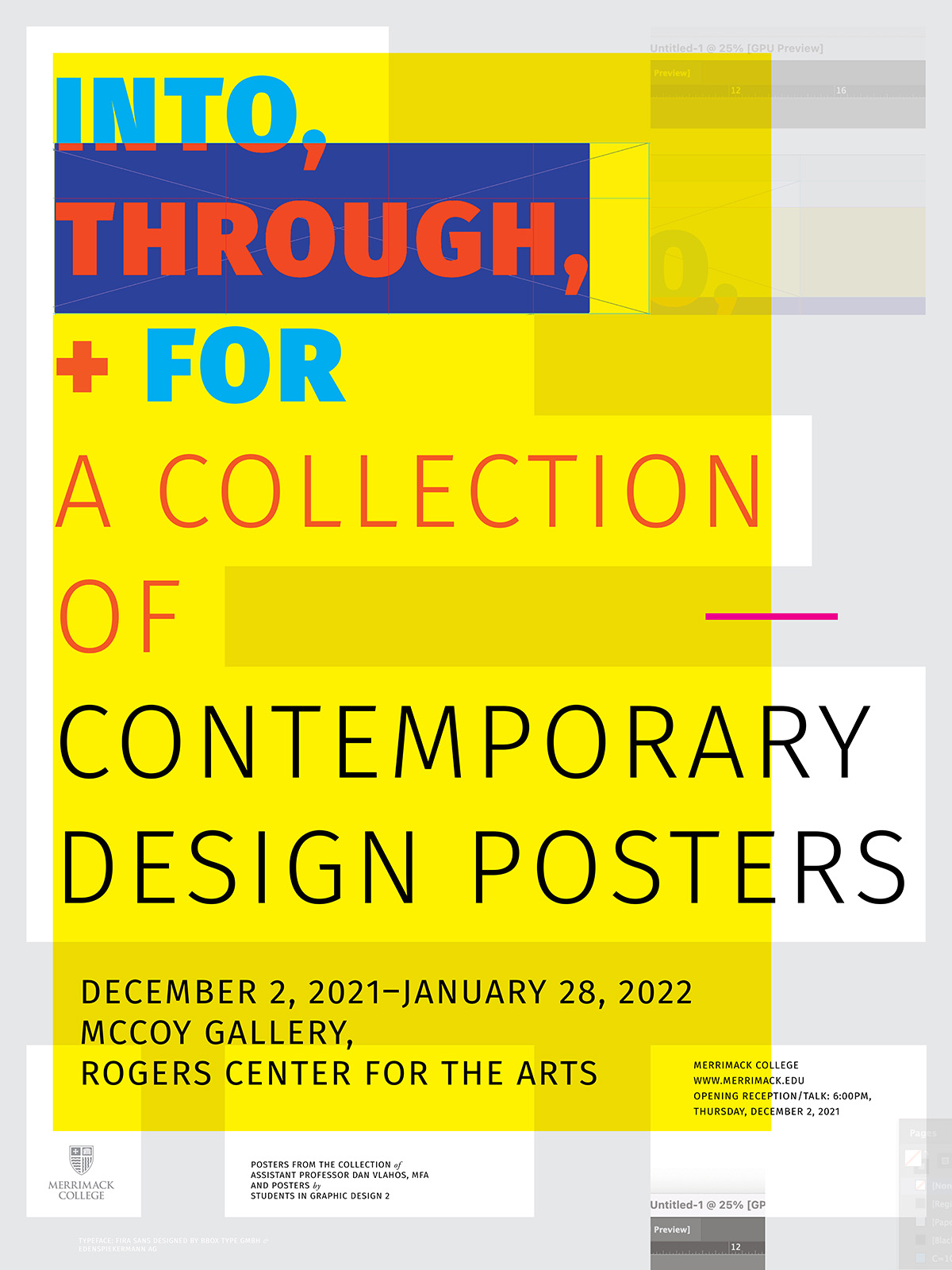
In the digital age, how do design-oriented posters embody design as culture, communication, and form within a global and local context? In late 2021, I curated and exhibited an international collection of posters based on the theme of “into, through, and for design.” This public exhibition, which ran from December 2, 2021–January 28, 2022, in the McCoy Gallery, Rogers Center for the Arts at Merrimack College was attended by members of the Greater Boston design community and also the Merrimack College community. Posters in the exhibition included ones designed by Amsterdam-based graphic design studio Experimental Jetset, AIGA Medalist Chris Pullman, and the London-based independent design studio Bibliothèque. Many of the posters in the exhibition were hand-signed by the designers or directors.

During the planning and curation process, Nancy Wynn, Chair of Visual and Performing Arts at Merrimack suggested that I consider making the exhibition participatory. Wynn’s wonderful suggestion served as a catalyst for inviting my own graphic design students to custom design a set of posters within the theme of the exhibition.

I started collecting design-oriented posters in the late 1990s. Many of these posters are connected to our local (Boston) design history, while others exemplify an international history of design. One of the great qualities many posters are that they are designed to be “self-exemplary.”

Much like the posters in this exhibition, in Edward Tufte’s 2006 book Beautiful Evidence, Tufte states that, “My books are self-exemplifying: the objects themselves embody the ideas written about.” The same could be said of many, if not all, of the posters included in this exhibition. For instance, Experimental Jetset’s 2006 poster was designed to promote Gary Hustwit’s typeface-inspired documentary film Helvetica. To further exemplify the film’s theme, the poster is set in large-scale left-aligned Helvetica, with text that reads, “Meet the cast.” This is followed by an all-caps A–Z Helvetica alphabet, who are arguably the “characters” in the film.

In December 2021, I had the pleasure of attending Dan Vlahos’ Into, Through, + For: A Collection of Contemporary Design Posters exhibition at Merrimack College. From the first moment I entered the gallery, I was encapsulated by a world-class collection of pieces, each visually impressive on their own. The visual language that each poster portrayed told an engaging story. I analyzed every detail, as the poster messages were so clearly spoken in their own medium. I could easily determine the subject, material, and time period of when these pieces were made. This was all tied together with a crash course on the history of each piece provided by Vlahos. It was clear that he cared for the artistry and what made each piece special. I left with a sense of inspiration and newfound knowledge that I did not have before.

Nel DeYoung, UX/UI Designer, Greater Boston

The poster, be it digital or physical, has been, is, and will continue to be a globally celebrated vehicle for communication, expression, and cognition. Posters are used to protest, express, persuade, celebrate, promote, inform, and delight. Through continuous advances in typesetting technologies, the poster and graphic design itself have increasingly become radically democratized. From the 1980s on, professional graphic designers and amateurs could independently compose high-quality layouts at far less expense. This “desktop publishing revolution” unleashed typesetting technologies that were once only the realm of publishing professionals. Today, anyone with a laptop and any number of software packages is a “typesetter” or “imagesetter” and, thus, a graphic designer in some form.

This democratization may also help explain why design has become such a widely celebrated contemporary cultural practice. Amateur and enthusiast designers now join graphic design professionals in finding ways to both practice and celebrate design. Films, posters, and other artifacts concerning numerous aspects of design serve as cultural evidence. The posters in this exhibition showcase design tools, techniques, efforts, products, and innovations—evidence of objects, culture, and history. One way to frame these artifacts, and the catalysts for the title of the exhibition is Sir Christopher Frayling’s three-part definition of design research,—which imparts three critical modes of inquiry: research into design, research through design, and research for design. In various ways and to different degrees, the posters in this collection exhibit all three of Frayling’s three modes. Some of the posters are educational, some are informational, and some are promotional—but most fall into several of these categories. In and of themselves, they are also beautiful examples of visual communication and design. Into, Through, and For celebrates the poster as an embodiment of design as culture, communication, and form within a global and local context.

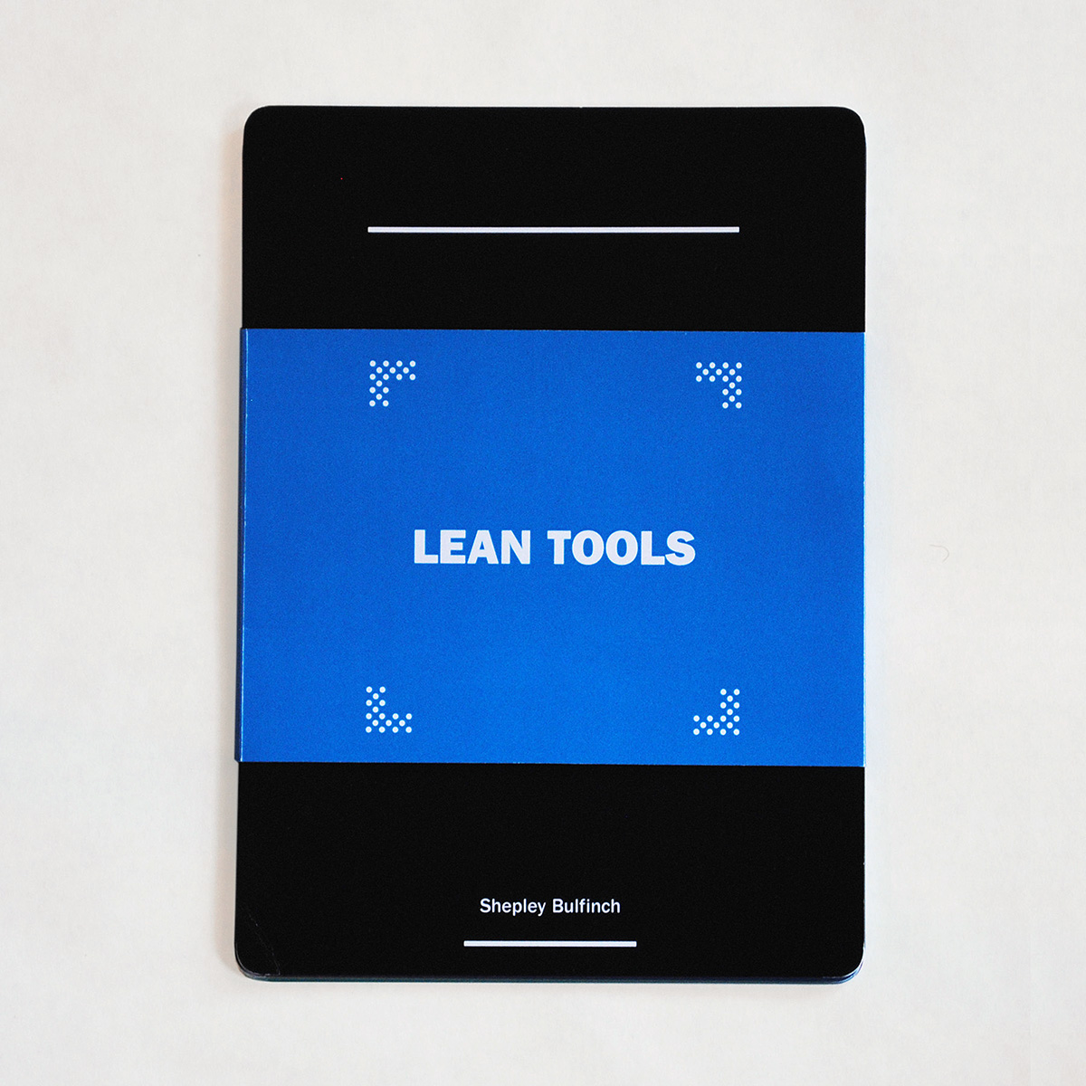
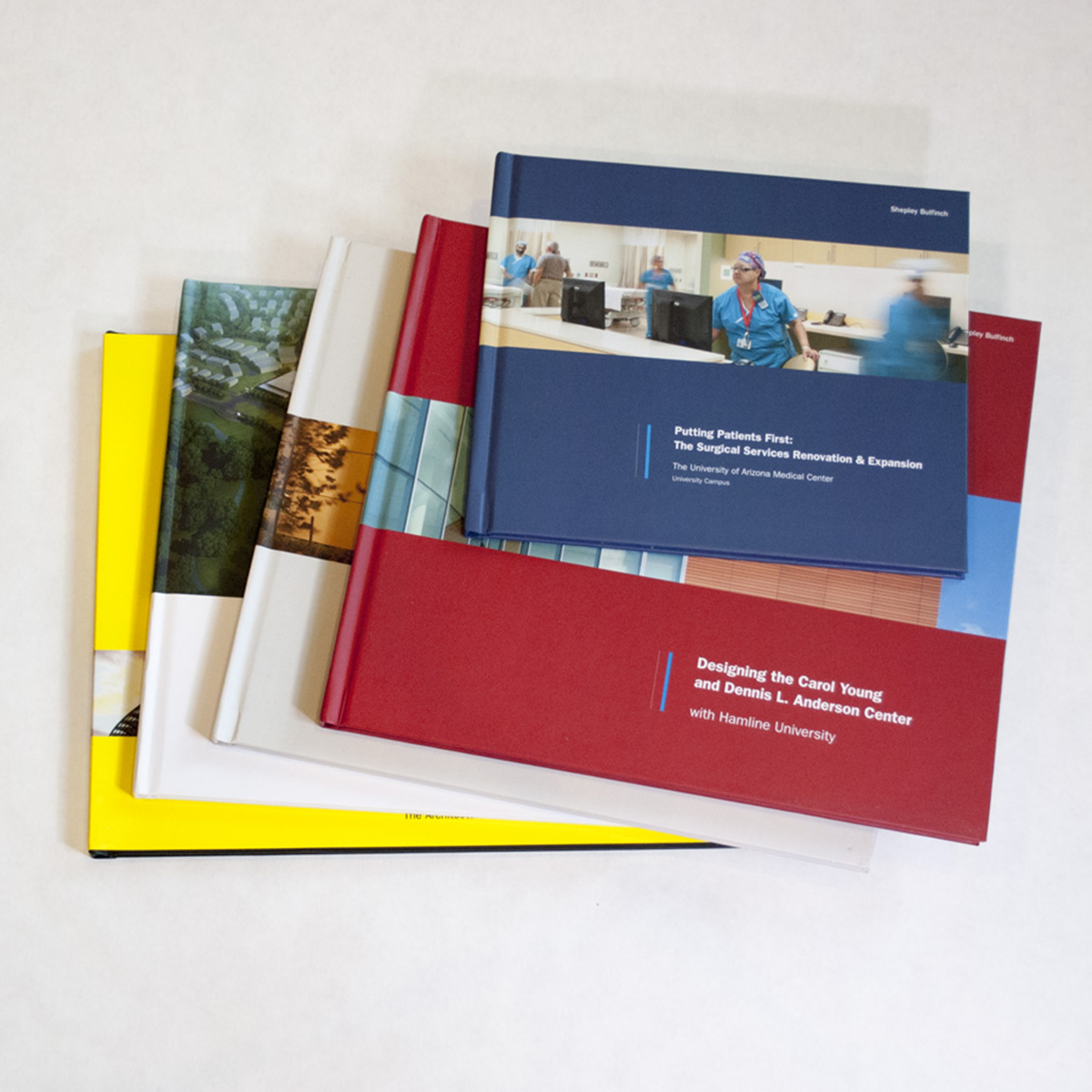
Besides curating, planning, promoting, and organizing the show, I also developed the graphics and signage for it. One of my own posters—a 2009 poster for the architecture firm Shepley Bulfinch—appeared in the show. The poster won the 2009 AIGA Best of New England design award. A public talk and lecture were given in the gallery on December 2, 2021.

Credits—

Exhibition Design and Curation: Dan Vlahos
Interim Gallery Director: Jonathan Latiano
Student Participants: Nicholas Andriotakis, Jeff Converse, Sahana Gorur, Charles McGarigle, Lily Seremet, Gabriela Terrones, Oliver Williams

Visual Identity and Branding for New England Conservatory, 2017.

Can a new visual identity shift an institution towards a future-facing mission and brand? New England Conservatory educates and trains musicians of all ages from around the world, drawing on the talent and deep reservoir of experience of their distinguished faculty. In 2017, the award-winning Boston-based branding/design firm minelli inc tapped Dan Vlahos Design to participate in the development of visual identity concepts for New England Conservatory (NEC). NEC is one of the oldest conservatories in the country, well-known in the music world for its deep ties to the Boston Symphony Orchestra. NEC hired Minelli to develop and implement a new visual identity that would dramatically increase brand awareness and position the school as an innovative leader throughout Boston’s cultural landscape. 

NEC’s focus on excellence, daily music-making and performance, and its unique collaborative culture are central to the brand idea we produced for them: The future of music, made here. In the visual identity we developed, NEC breaks with the music industry’s pervasive use of concert photography. Instead, black-and-white portraits show students with their instruments. A bold pattern of colored bands, inspired by auditory patterns in music, are a dominant graphic element used throughout the identity.

Credits—

Design firm: minelli Inc.
Design Director: Mark Minelli
Writer/Strategist: Nancy Jenner
Design Direction: Dan Vlahos
Senior Designer: Becca Mayfield

Chip Dewing: At Home in the Landscape, Book Design, 2020.

Chip Dewing: At Home in the Landscape Book Cover

How might a monograph for a regional architect be designed sustainably while also expressing the physicality and object quality of the book itself? Chip Dewing, AIA founded DSA (now DSK) with his partner Mark Schmid in 1984 after working together in Boston architectural firms for several years. Over the years, the firm has received several design awards. Chip earned his bachelor’s degree from the University of Pennsylvania in 1970 and a master’s degree in architecture from Harvard’s Graduate School of Design in 1973.

As a limited-edition, hard-bound, 109-page volume, Chip Dewing: At Home in the Landscape chronicles and documents the highly contextual work of this contemporary American architect. Dewing’s early design work focused heavily on the renovation of historic structures. Dewing’s later work fuses past architectural styles with more contemporary approaches—while thoughtfully and oftentimes elegantly integrating the projects’ contexts and programmatic requirements. In all cases, Dewing strived to respond to the broader context of the site and its architectural heritage. Regardless of the aesthetics, the projects selected for this book underscore the importance of integrating architecture into its surroundings. As such, the book’s subtitle, At Home in the Landscape, was carefully chosen as an introduction to the projects featured. The book contains several original essays, an Introduction by Mark Schmid, AIA, and 20 projects selected by Dewing, myself and the editor—all completed between 1992–2020. The book is printed on 100# premium matte Forest Stewardship Council (FSC)-certified paper and bound in a hardcover layflat format. Along with being FSC certified, the paper is acid-free, which ensures the long-term preservation of the book and our environment. The book was printed in the U.S., which reduced the shipping distance and carbon required for transport. The book design was inspired by British minimalist graphic design—most notably the work of William Hall—formed by Hall and Nicholas Barba when they left the architectural studio of John Pawson in 2003. Because the book is printed using on-demand production techniques (versus a larger run), the resources required to produce the book are more accurately managed.

Over the course of his practice, Dewing saw the architectural design profession grow increasingly aware of the tremendous impact a building has on both local and broader environments. While Dewing embraced many tools available to lower a building’s impact, he was keenly aware that unless the design is sited carefully and unless the envelope is detailed properly, any gains toward sustainability may be lost.

In the closing section, there are three big lessons that Dewing shares in an Afterword. The first is to Address the site; the second is to Convey a sense of place, and the third is to Communicate a sense of arrival. Dewing shares these key lessons as he steps away from the firm that he co-founded. With a special focus on addressing, conveying, and communicating—there are certainly lessons embedded in Dewing’s architectural practice and thus the book itself—but moreover, there is a sense of care, attention, and delight. In this way, according to his clients, Dewing helped establish an “ethos” that served to propel the present-day DSK towards a vast mix of architecture and planning projects nationwide.

Credits—

  • Edited by: Terri Evans
  • Photography: Lauren Stimson, Anton Grassl, Stephen Stimson, Jonathan Levitt, Eric Roth, Mark Doyle, Chuck Mayer, Rick Mandelkorn, Nick Wheeler, Joe Wallace
  • Book Design: Dan Vlahos
  • Portfolio Photography: Nicholas Paolino

Case Studies—

Boston Strong Graphic in Support of the One Fund Boston, 2013.

Boston Strong Muscle Graphic

Boston Strong was a slogan that surfaced in the aftermath and reaction to the Boston Marathon bombings in April of 2013. As a Boston-native, Boston-based-design designer and former Boston Marathon running participant I contributed this commemorative icon for use on buttons and other materials.

The graphic was also posted to my website where I simply asked that folks who used the graphic consider making a donation to the One Fund Boston, a fund formed by Governor Deval Patrick and Mayor Thomas M. Menino on April 16, 2013 with the purpose of helping those most affected by the tragic Marathon bombings.

This work is licensed under a Creative Commons Attribution-NonCommercial-ShareAlike 4.0 International License.

Eye Heart MassArt Promotional Campaign for the MassArt Alumni Community, 2008.

Eye Heart MassArt

The Eye Heart MassArt promotional branding campaign was used to promote MassArt’s 2008 Alumni Weekend. It prominently featured the MassArt logo—which has been recently updated by moth design, along with graphic elements paying direct homage to the American graphic design giants Paul Rand (the eye from Rand’s work for IBM) and Milton Glaser (the heart from I ❤ NY). I received my a BFA in Graphic Design from MassArt in 2000 and and MFA from MassArt’s Dynamic Media Institute in 2017. For me MassArt has been like a second family—where for many years I have remained engaged through teaching, the annual auction, the MassArt Art Museum, the alumni leadership council and many wonderful continuing education courses in fine arts and design.

To promote the event the postcard was mailed to Massachusetts College of Art and Design alumni. A tee shirt and button were also produced for the event. In 2010, Cutwater, a design agency out of San Francisco developed a very similar and wonderfully executed “eye heart LC” concept for Lens Crafters.

Limited Edition Monographs and Books for Shepley Bulfinch, 2011–2013.

Shepley Bulfinch Monographs and Books

This series of limited edition series of monographs and books on the projects and process of Shepley Bulfinch reflected on the contributions of the firms’ Principal architects, expertise and milestone projects. As a form of visual storytelling the books let photography, sketches, diagrams and other visual material tell the stories while the typography and writing are largely limited to introductions and captions. The design of the books were inspired by the work of the late Massimo Vignelli, especially his books for Richard Meier.

Also, just was I had started working with this firm I acquired a copy of Projects for Prada Part 1 (2001) an architectural process book of sorts on the work of Rem Koolhaas—which both surprised and inspired me by its focus on process over product. Then, Rob Roche the Shepley Bulfinch archivist presented me with a beautiful monograph from the Shepley Bulfinch archives—the book was Katsura: Tradition and Creation in Japanese Architecture by Walter Gropius, Kenzo Tange and Yasuhiro Ishimoto. It was designed by Herbert Bayer around 1960. The layout and image proportions within the book are masterful and the photos themselves are wonderfully flat, poetic and masterfully composed. Overall the book is graphic (which is obviously appealing to a graphic designer) but also “moody.” The printing is exquisite and the cover is adorned with lovely embossed symbol.

The art direction and design of these books helped shape the overall art direction of the firms materials—which is still evident to this day.

Visual Identity and Branding for The Fenway Alliance, 2010.

Fenway Identity/Logo

The Fenway Alliance turned to the planning practice at Shepley Bulfinch as it sought to develop a regional strategic plan. When “identity” was unearthed as one of the key strategic themes the planning practice brought in my in-house graphics group to help design a visual identity and branded materials which were used by the Alliance to further develop and strengthen the Fenway urban and regional identity.

Through a series of community-based design charities the focus of the Alliance’s efforts were further refined and defined. The final Fenway logotype appropriates letterforms from the neighboring institutions the Alliance represents and shades of green from local landmarks—along with the verdigris copper frequently seen in the area’s architecture. The new identity helped position the Fenway Alliance for regional identity initiatives— and helping it to achieve an official designation as a Massachusetts Cultural District.

Neighborhood Celebration Promotional Poster for Mission Hill, 2009.

2009 Mission Hill Neighborhood Celebration Poster

To promote the first-ever Mission Hill Neighborhood Celebration in Boston I was invited to design promotional materials, including silkscreen posters, tee shirts, email banners, and fliers. I also created a Mission Hill “MH” monogram to be used for subsequent community events, concerts, and fundraisers.

Bold, sans-serif typography and the way the typography was positioned to align from line to line give the poster a feeling of unity. The spacing (or “tracking”) between the letters of the last word (together) is reduced, with the characters kerned nice and snug. These posters were then hand-printed and silkscreened by Lucky Bunny Visual Communications.

For a period of time in the late 20th century, Mission Hill was incorrectly viewed as one of the most dangerous areas of Boston. This was largely because of the 1989 staged murder committed by Charles Stuart—in which Stuart drove into the Mission Hill neighborhood and then staged the killing of his own wife while then telling police that a black man shot her. The story made national headlines.

Today, Mission Hill is one of the most diverse neighborhoods in the city of Boston and is experiencing a renaissance of sorts. Today, the community is comprised of students, long-time residents, the elderly and professionals, mostly from the nearby Longwood Medical and Academic Area.

This community event was made possible through the generous support of local businesses, community groups and a seed grant from the Mission Hill/Fenway Neighborhood Trust.

Dan Vlahos and—

Rich DeSimone, Lucky Bunny, Silkscreen Printing

Case Studies—

Arts Engagement for Healing and Transformation in Mission Hill, 2009–2023.

Website Redesign for Shepley Bulfinch, 2009

Shepley Bulfinch Website

In what became a crucial component of a longer term strategic rebranding this firm, the redesigned website for Shepley Bulfinch helped change the value proposition of the firm from architectural services, to services and design. The site adopted a clean approach focused on showcasing projects and photography with plenty of white space and and classical proportions. As Creative Director my role was to develop and oversee strategy, contribute to the design, lead creative direction, project manage and assist with content development.

The new website and the strategic rebranding of the firm helped lead to the firm’s from one office in Boston—to multiple offices across the US. In 2018 the Shepley Bulfinch website and branding was wonferfully updated by Tammy Dayton and her team at moth.

Dan Vlahos and —

Jennifer Jonsson, Project Manager
Pamela Scheideler, Project Manager
Steven Potter, Design Direction
Josh Pryor, Web Development
Terri Evans, Communications
Adam Larson, Contributing Designer
Paulo Lopez, Contributing Designer
Erin Deeley, Contributing Designer

Awards—

Rebrand 100 Global Awards, 2008
Best in Class, Interactive Media Council, 2009

MassArt Art Auction Branding and Design for the MassArt Foundation, 2004–2012.

During the nearly ten years I worked on the MassArt Auction this annual event grew into a nationally recognized venue for contemporary artworks—showcasing the work of leading artists, faculty and alumni of the college—thus helping to “bolster” the broader MassArt “brand.”

For each of these years I designed the invitation, catalog, promotional materials, environmental graphics, wayfinding and signage for what has become the college’s premier annual fundraising event.

Alumni from MassArt’s Graphic Design program have assumed responsibility guiding the project with Tom Davis (’76) and others designing the materials before me—and Bryant Ross (’04) and others afterwards.

Dan Vlahos and—

Jonathan Richard, Layout Artist
Jeff Vlahos, Graphic Design

Agents of Change Badge Graphic for Shepley Bulfinch, 2010.

Shepley Bulfinch Agents of Change Badge

The Shepley Bulfinch “Agents of Change” badge graphic was developed to communicate the idea that architecture is not just about building or buildings—but also serves as a strategic mechanism for personal, organizational, institutional, and transformational change. The graphic was utilized in both the annual mailing to clients and in an internal card from the President to all staff.

The badge-like graphic was constructed using iconography from the firm’s first logo—a hand-drawn monogram by H.H. Richardson himself drawn around 1882. In a letter to his wife, Richardson described his original seal as “two strange beasts biting at a piece of forbidden fruit,” symbolizing the forbidden. Oddly enough, this reminded me of the wonderful tension between both knowledge and irreverence evident in the present-day Apple logo.

To make things even “stranger,” I then added a self-constructed Latin neologism, “certus intention,” which— at the time—I surmised to roughly translate into “certain intention,” but it could also mean “definitely plan” or even “defining design.” I suppose I was hoping the firm might adopt it as a motto of sorts—or a more abstract way of saying what William McDonough once said: “Design is the first signal of human intention.” Also, “the forbidden” in Richardson’s remarks sparked my interest in further exploring the negative impacts of design—and its role in contributing to crisis. The badge graphic itself was inspired by the work of the American artist and activist Shepard Fairey.

Credits—

  • Erin Deeley, Graphic Design
  • Dan Vlahos, Creative Direction

Case Studies—

Vlahos, Dan. The Education of a Communication Designer. Boston, 2017.

The Education of a Communication Designer was my master’s thesis book submitted to The Dynamic Media Institute at Massachusetts College of Art and Design (MassArt) in 2017. This 200 page volume largely documents a series of seven case studies. Each of the seven case studies are also presented as video abstracts—which are listed below.

  1. Isabella: A Dramatized Digital Personification, 2015.
  2. MetaPieces: An Interactive Art Making Table, 2015.
  3. Fingering Randomizer for Bb Trumpet: An Interactive Multimodal Learning and Performance Environment, 2016.
  4. The Perfect Character: A Typographic Film Character Creation Tool, 2016.
  5. Critiquemate: A System for Exploring Critique Methods and Managing Feedback, 2016.
  6. Lecturemate: A Multimodal System for Viewing and Understanding Lectures, 2016.
  7. Studiomate: A Peer-to-Peer Help System for Studio Communities, 2016.

The Education of a Communication Designer explores and evaluates new tools, systems, and heuristics for teaching and learning in the arts and beyond. Through these learning experience (LX) design-based investigations, I speculatively re-imagine and re-contextualize the relationship between learners, educators, and peers within a range of learning environments. Drawing inspiration from Professor Gunner Swanson’s essay, “Design and Knowledge in the University and the ‘Real World,’” all seven case studies are guided by a set of four interrelated themes: communication, expression, interaction, and cognition, which according to Swanson represent four broad areas that graphic design could bridge. The book is currently available in the following formats:

PDF Download (Free)
Hardcover ($49.47 USD) from Blurb

Throughout my thesis I continually re-examine “graphic design” and place it in the broader context of “communication design”—a comprehensive field that posits a wider range of media, disciplines, technologies, and applications. Much of the research and inspiration for my thesis is derived from Steven Heller’s 2015 anthology The Education of a Graphic Designer to which the title of this thesis alludes. By replacing Graphic with Communication, I am largely acknowledging a personal shift from the strictly “graphic” (mainly designing visual artifacts) to a wider practice of designing experiences, interactions, and systems. While the experiences, interactions, and systems that I have explored here primarily focus art, design and creative learning, one can easily imagine how these multimodal interactive learning techniques could be used as broader assistive learning tools, or as catalysts for interdisciplinary communication and collaboration.

Credits—

Joseph Quackenbush, Professor, Thesis Seminar I
Lisa Rosowski, Professor, Thesis Seminar II
Jan Kubasiewicz, Professor, Thesis Project I & II