Work Category: Other

Love One Another!, Poster, 24 x 36 in, 2026.

Love One Another Poster

In 1967, the American rock band The Youngbloods[1] released their self-titled debut studio album,[2] which featured the iconic track “Get Together.”[3][4] A few years later (in 1969), The Youngbloods’ rendition of “Get Together” rose to No. 5 on the Billboard Hot 100 charts.[5] “Get Together” (originally titled “Let’s Get Together”) was written in the mid-1960s by American singer-songwriter Chet Powers (aka Dino Valenti). While the Youngbloods version of the track has remained the most ubiquitous, it was also recorded and released on side two of Jefferson Airplane Takes Off,[6] the American rock band Jefferson Airplane’s debut studio album (1966). Several other bands have performed or recorded the track. The signature refrain in “Get Together,” which commences with “Come on, people now,” is usually repeated seven times over the course of the track:

Come on, people now
Smile on your brother
Everybody get together
Try to love one another right now

From the Bible[7][8] to The Youngbloods, humanist calls to “love one another” have not abated. Along these lines, musicologists often point to “Get Together” as an apolitical anthem. Even though The Youngblood’s lead singer, Jerry Corbitt, got his start as a bluegrass musician and folk singer in Cambridge, Massachusetts,[9] “Get Together” is often associated with the “San Francisco sound.”[10]

This poster utilizes a playing-card-like composition with Hermann Zapf’s heart “Dingbat” (❤), designed by Zapf in 1978,[11] placed in the upper left corner. A slightly modified version of Franklin Gothic (Morris Fuller Benton, 1902) is used for the large number one. “ANOTHER” is set in Compacta typeface (designed by Fred Lambert in 1963). The poster credits in the upper right are set in Minion (designed by Robert Slimbach in 1990). The woodcut-style illustration is by Christos Georghiou. The exclamation point is a digital scan of a vintage wood type letterpress print. The “!” used to make the print was supplied by Type High Letterpress, which I then printed using a handmade Provisional Press. The resultant rubber-ink-on-paper print was digitally scanned and incorporated into the composition as a “knock out.” In 2026, the poster was accepted into AIGA Maine’s “Language” themed[12] Poster Show.

In her 2025 book Peace by Design, Mardelle McCuskey Shepley states, “In a world where peace seems continually at risk, the charge to contribute to harmony is a responsibility of us all.”[13] Later she suggests that, “Community engagement and collaboration are at the core of peace, as sharing perspectives among and between groups and individuals is a pre-requisite to conciliation.”[14]

I am most certainly not the first designer to explore “love one another” as a poster theme. For instance, Allan Peters, the Chief Creative Officer of Peters Design Company, offers several[15][16] similarly themed posters in his online shop.

Exhibitions—

  • AIGA Maine 2026 Poster Show Tour, Juried by Amy Hausmann, Executive Director of the Maine Arts Commission
    • Flatiron Coffee, Portland, ME, May, 2026
    • Jesup Memorial Library, Bar Harbor, ME, June–September, 2026
    • Bangor Public Library, Bangor, ME, October–November, 2026

Footnotes

  1. See: “The Youngbloods.” Wikipedia, The Free Encyclopedia, Wikimedia Foundation, 25 Mar 2026, https://en.wikipedia.org/wiki/The_Youngbloods.
  2. See: “The Youngbloods (album).” Wikipedia, The Free Encyclopedia, Wikimedia Foundation, 1 Apr 2026, https://en.wikipedia.org/wiki/The_Youngbloods_(album).
  3. Listen here: https://youtu.be/7xGxQXmu7Os.
  4. See: “Let’s Get Together (Chet Powers song).” Wikipedia, The Free Encyclopedia, Wikimedia Foundation, 2 Feb 2026, https://en.wikipedia.org/wiki/Let%27s_Get_Together_(Chet_Powers_song).
  5. Ibid.
  6. See: “Jefferson Airplane Takes Off.” Wikipedia, The Free Encyclopedia, Wikimedia Foundation, 15 Dec 2025, https://en.wikipedia.org/wiki/Jefferson_Airplane_Takes_Off.
  7. John 15:17
  8. John 13:34
  9. See: “Jerry Corbitt.” Wikipedia, The Free Encyclopedia, Wikimedia Foundation, 29 Mar 2026 https://en.wikipedia.org/wiki/Jerry_Corbitt.
  10. See: “San Francisco sound.” Wikipedia, The Free Encyclopedia, Wikimedia Foundation, 29 Mar 2026, https://en.wikipedia.org/wiki/San_Francisco_sound.
  11. See: “Zapf Dingbats.” Wikipedia, The Free Encyclopedia, Wikimedia Foundation, 28 Feb 2026, https://en.wikipedia.org/wiki/Zapf_Dingbats.
  12. See: https://mainearts.maine.gov/postings/blogs/detail/AIGA-Maine-2026-Poster-Show-Open-Call.
  13. Shepley, Mardelle McCuskey. Peace by Design. Routledge, 2025, p. 3.
  14. Ibid, p. 188.
  15. See: https://www.petersdesigncompany.com/shop/love-one-another-poster.
  16. See also: https://www.petersdesigncompany.com/shop/love-one-another-print.

SY Bench, 36 x 16 x 17.5 in, 1997.

SY Bench

In my second year of art school, I enrolled in a studio foundation-level class titled “Three-Dimensional Design.” In this course, the instructor assigned a project calling for each student to design and fabricate a bench. What exactly a ” bench ” was seemed open to interpretation.

One of the required supplies for the course was a small miter box and saw set, which students used to cut balsa wood into a scale model mockup—in this case, of their bench concept before they built it as a full-size prototype. My model explored a low, Japanese-style wooden bench that I had hoped would comfortably seat one or two. Furthermore, I surmised that this bench could just as well serve as a small coffee table. Oddly enough, in my sketches I also referenced vintage wooden-box style lobster traps, which I had frequently seen used to make makeshift tables and other furniture in New England homes.

While working on my bench model, a professor suggested that I secure a copy of George Nakashima’s 1981 book The Soul of a Tree. Nakashima[1] (1905—1990) was a Japanese-American woodworker and architect who became a leading figure of the American Studio Craft movement.[2] The Foreword of Nakashima’s book, written by George Wald,[3] described Nakashima as “an extraordinarily quiet man,” further stating that, “Nakashima’s silence goes with his wisdom of things.” In his closing paragraph, Wald stated:[4]

It is people like Nakashima who in every age realize that human promise, who construct our abiding human heritage. For things made of stone, and clay and wood endure, even as the generations come and go and cities and civilizations rise and fall. And the trees will be there always, watching in silent witness as they have done throughout the ages.

In The Soul of a Tree, Nakashima states, “A tree provides perhaps our most intimate contact with nature. A tree sits like an avatar, an embodiment of the immutable, far beyond the pains of man.”[5] After reading Nakashima’s book, I began to view wood as a material with a life and a narrative. As Wald noted of Nakashima in his Foreword, “he makes the dead wood live again in new ways,”[6] and as Nakashima himself noted, “We work with boards from these trees, to fulfill their [the trees’] yearning for a second life.”[7]

The following summer, I brought my unfinished full-size wooden bench, crafted from pine, to my parents’ home just north of Boston, where my father and grandfather helped me sand and stain it. As the three of us finished the bench, I reflected on the life of the material and thus the life of the object itself. In this moment, I sensed why my professor suggested Nakashima’s book. Along these lines, among the many student projects I completed in art school, this bench is the only artifact I’ve kept and used for over 20 years.


Footnotes

  1. See: “George Nakashima.” Wikipedia, The Free Encyclopedia, Wikimedia Foundation, 4 Mar 2026,https://en.wikipedia.org/wiki/George_Nakashima.
  2. See for instance the 2007 exhibition “One of a Kind: The Studio Craft Movement” at The Met: https://www.metmuseum.org/press-releases/one-of-a-kind-the-studio-craft-movement-2007-exhibitions.
  3. See: “George Wald.” Wikipedia, The Free Encyclopedia, Wikimedia Foundation, 2 Feb 2026, https://en.wikipedia.org/wiki/George_Wald.
  4. Nakashima, George. The Soul of a Tree. Kodansha International, 1981, p. xix.
  5. Ibid, p. xxi.
  6. Ibid, p. xviii.
  7. Ibid, p. xxi.

Towards a Dynamic Discipline of Design, Motion Graphics Film, 2025.

Towards a Dynamic Discipline of Design Promo Poster

Towards a Dynamic Discipline of Design is an educational, exploratory, and diagrammatic journey into design’s epistemological, ontological, and cultural positions and potentials. The film premiered at the 2025 MODE Summit in Prague. This film asserts that “static” notions of design—and thus static representations of design should be reassessed. In support of this view, viewers traverse through “diagrammatic discourses” of design over the past century—which eventually lead to a set of kinetic representations that attempt to more accurately and engagingly visualize design practice and design culture. Building upon the work of figures such as Bruce Archer, the film secondarily advocates for design as a third epistemological culture. As an information-based design film, Towards a Dynamic Discipline of Design could be seen in the lineage of films[1] such as Powers of 10 (1977), written and directed by Charles and Ray Eames.

Media

Credits

  • Written, Narrated, and Directed by Dan Vlahos
  • Motion Graphics Led by Steven Cotroneo

Featuring Diagrams By

  • Al Gowan
  • Bruce Archer
  • Terry Irwin
  • Julio Mario Ottino + Bruce Mau

Additional Notes, Credits + Resources

Soundtrack + Audio

Further (Suggested) Reading

Ebenreuter, Natalie. “The dynamics of design.” Kybernetes, vol. 36, no. 9/10, 2007, pp. 1318-1328. https://doi.org/10.1108/03684920710827328.

Fried, Geoffry. “Chasing Infinity: Defining the Purpose of Design.” Proceedings of the International Association of Societies of Design Research (IASDR) 2009, Seoul, Korea, October 18-22, 2009, pp. 3645-3654. 

Gentes, Annie. The In-Discipline of Design: Bridging the Gap Between Humanities and Engineering. Springer, 2017.

Hübner, Patrik, The Generative Mind: A New Approach to Creative Thinking, Niggli, 2025.

Lee, Sheng-Hung. “From computation to curation: Expanding the boundaries of design practice.” Design Studies, vol. 101 (2025), https://doi.org/10.1016/j.destud.2025.101357.

Mages, Michael Arnold, and Stephen Neely. Somaesthetic Design: The Experiencing Body and the Dynamics of Time. Transcript Design, 2026.

Oxman, Neri. “Age of Entanglement.” Journal of Design and Science, Jan 2016, https://doi.org/10.21428/7e0583ad.

Sceenings, Workshops + Talks

  • International Premiere, 2025 MODE Summit, Hosted by the Anglo American University, 19-21 June 2025.
  • Lesley University, Design Thinking & Research with Professor Kristina Lamour Sansone, Panel Discussion with Professor Emeritus Geoffry Fried, 11 September 2025.

Media Coverage + Press


Footnotes

  1. The format explored here, which includes video, motion graphics, artifacts, and voiceover narration, builds upon what Jarrett Fuller described as a “video essay” in his 2016 film A Rough Sketch for a Video Essay as Design Criticism. Fuller cites Orson Welles, along with Charles and Ray Eames, as precedents and notes that, “The video, or film, essay gained popularity in the 1950s and 60s that trades typical narrative plots for themes and investigations.” More at: Fuller, Jarrett. “A Rough Sketch for a Video Essay as Design Criticism.” 2016, https://jarrettfuller.com/projects/roughsketch.

changeResolution Script for Adobe InDesign, 2022.

Once upon a time, old-school Adobe InDesign users viewed images and text at 100% scale (when InDesign was zoomed to 100%). That meant that each pixel in an image took up one pixel on your monitor. That is no longer the case, however. Since many screens are no longer 72dpi InDesign now tries to approximate an inch from the physical world to an inch on the computer screen. For those who still desire the accuracy and control of designing 1:1 pixel (for website mockups, wireframes etc.) this is a bit maddening.

Luckily there’s an easy way to “toggle” back and forth between monitor resolution modes in InDesign. To do so I have assembled a Script that makes the task quite manageable. Just follow these steps and you’ll be off and running.

  1. Download the changeResolution Script here.
  2. Navigate to your Applications folder, then the Adobe InDesign folder.
  3. Look for a folder called “Scripts.”
  4. Within “Scripts” look for the “Scripts Panel” folder and place the entire changeResolution folder that you downloaded into this folder.
  5. Relaunch Adobe InDesign.
  6. Open Window > Utilities > Scripts and look for the changeResolution folder within the Application folder.
  7. Double click “set_indesign_screen_resolution_to_web.js” to view images at 100% pixel scale.
  8. Zoom in or out for the change to take effect.
  9. Double click “set_indesign_screen_resolution_to_print” to return to InDesign’s default view.
  10. Enjoy!

Credits—

Scripts: Dan Vlahos
Coding: Michael Stanaland

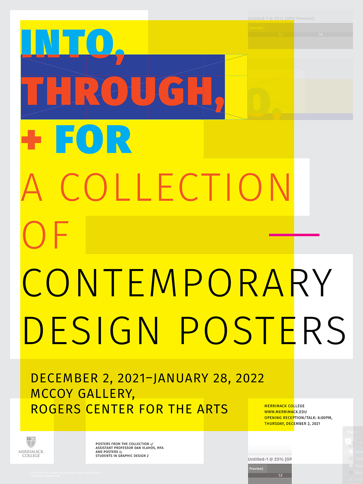
Into, Through, + For: A Collection of Contemporary Design Posters, Exhibition, 2020–2021.

In the digital age, how do design-oriented posters embody design as culture, communication, and form within a global and local context? In late 2021, I curated and exhibited an international collection of posters based on the theme of “into, through, and for design.” This public exhibition, which ran from December 2, 2021–January 28, 2022, in the McCoy Gallery, Rogers Center for the Arts at Merrimack College was attended by members of the Greater Boston design community and also the Merrimack College community. Posters in the exhibition included ones designed by Amsterdam-based graphic design studio Experimental Jetset, AIGA Medalist Chris Pullman, and the London-based independent design studio Bibliothèque. Many of the posters in the exhibition were hand-signed by the designers or directors.

During the planning and curation process, Nancy Wynn, Chair of Visual and Performing Arts at Merrimack suggested that I consider making the exhibition participatory. Wynn’s wonderful suggestion served as a catalyst for inviting my own graphic design students to custom design a set of posters within the theme of the exhibition.

I started collecting design-oriented posters in the late 1990s. Many of these posters are connected to our local (Boston) design history, while others exemplify an international history of design. One of the great qualities many posters are that they are designed to be “self-exemplary.”

Much like the posters in this exhibition, in Edward Tufte’s 2006 book Beautiful Evidence, Tufte states that, “My books are self-exemplifying: the objects themselves embody the ideas written about.” The same could be said of many, if not all, of the posters included in this exhibition. For instance, Experimental Jetset’s 2006 poster was designed to promote Gary Hustwit’s typeface-inspired documentary film Helvetica. To further exemplify the film’s theme, the poster is set in large-scale left-aligned Helvetica, with text that reads, “Meet the cast.” This is followed by an all-caps A–Z Helvetica alphabet, who are arguably the “characters” in the film.

In December 2021, I had the pleasure of attending Dan Vlahos’ Into, Through, + For: A Collection of Contemporary Design Posters exhibition at Merrimack College. From the first moment I entered the gallery, I was encapsulated by a world-class collection of pieces, each visually impressive on their own. The visual language that each poster portrayed told an engaging story. I analyzed every detail, as the poster messages were so clearly spoken in their own medium. I could easily determine the subject, material, and time period of when these pieces were made. This was all tied together with a crash course on the history of each piece provided by Vlahos. It was clear that he cared for the artistry and what made each piece special. I left with a sense of inspiration and newfound knowledge that I did not have before.

Nel DeYoung, UX/UI Designer, Greater Boston

The poster, be it digital or physical, has been, is, and will continue to be a globally celebrated vehicle for communication, expression, and cognition. Posters are used to protest, express, persuade, celebrate, promote, inform, and delight. Through continuous advances in typesetting technologies, the poster and graphic design itself have increasingly become radically democratized. From the 1980s on, professional graphic designers and amateurs could independently compose high-quality layouts at far less expense. This “desktop publishing revolution” unleashed typesetting technologies that were once only the realm of publishing professionals. Today, anyone with a laptop and any number of software packages is a “typesetter” or “imagesetter” and, thus, a graphic designer in some form.

This democratization may also help explain why design has become such a widely celebrated contemporary cultural practice. Amateur and enthusiast designers now join graphic design professionals in finding ways to both practice and celebrate design. Films, posters, and other artifacts concerning numerous aspects of design serve as cultural evidence. The posters in this exhibition showcase design tools, techniques, efforts, products, and innovations—evidence of objects, culture, and history. One way to frame these artifacts, and the catalysts for the title of the exhibition is Sir Christopher Frayling’s three-part definition of design research,—which imparts three critical modes of inquiry: research into design, research through design, and research for design. In various ways and to different degrees, the posters in this collection exhibit all three of Frayling’s three modes. Some of the posters are educational, some are informational, and some are promotional—but most fall into several of these categories. In and of themselves, they are also beautiful examples of visual communication and design. Into, Through, and For celebrates the poster as an embodiment of design as culture, communication, and form within a global and local context.

Besides curating, planning, promoting, and organizing the show, I also developed the graphics and signage for it. One of my own posters—a 2009 poster for the architecture firm Shepley Bulfinch—appeared in the show. The poster won the 2009 AIGA Best of New England design award. A public talk and lecture were given in the gallery on December 2, 2021.

Credits—

Exhibition Design and Curation: Dan Vlahos
Interim Gallery Director: Jonathan Latiano
Student Participants: Nicholas Andriotakis, Jeff Converse, Sahana Gorur, Charles McGarigle, Lily Seremet, Gabriela Terrones, Oliver Williams

Processional for Brass Quintet at deCordova, Original Score, 2014.

Processional for Brass Quintet

My wife Meredeth and I were married on January 4, 2014 at the deCordova Sculpture Park and Museum in Lincoln, Massachusetts. deCordova is a 30-acre sculpture park and contemporary art museum on the shore of Flint’s Pond, 20 miles northwest of Boston. It was established in 1950. It is the largest park of its kind in New England, encompassing 30 acres.

As a longtime pianist, trumpet player and music enthusiast I had always wondered if I could compose my own wedding music. In 2013 I began working with Steve Giles, a Berklee College of Music trained composer who along with my former design student Ben Hawkins helped me develop a “winter wedding processional” score for brass quintet. The main theme for the processional stemmed from my time studying jazz with the Brazilian pianist/conductor Samuel Kardos in the mid-2000s. Kardos, who now resides in New York City was in Boston at the time also to study at Berklee. In that time I composed a dozen or so short pieces for solo piano—Procession for Brass Quintet deCordova is based on one of those compositions. Kardos in now the Conductor of Lumen Philharmonia in New York City.

Files—

Full score and individual parts (.pdf). 
Live recording at deCordova (.m4a).

Dan Vlahos and—

Samuel Kardos, Piano and Composition Instructor
Ben Hawkins, Brass Quintet Leader
Steve Giles, Arrangement

This work is licensed under a Creative Commons Attribution-NonCommercial-ShareAlike 4.0 International License.

Blue Journal for Shepley Bulfinch, 2011–2014.

As a firm tradition, for years, the Boston-based architecture firm Shepley Bulfinch reached out to clients in an annual winter mailing. This mailing often took the form of a signed card, letter, or a commemorative poster or print. Over time, what started as a holiday gesture became an important statement that exemplified the firm’s core values.

In the time I spent helping to develop the firm’s brand, one of the biggest challenges was balancing its long history with its vibrant and creative future. It quickly became apparent to me that the previous mailings that celebrated old buildings were placing too much emphasis on the past while not emphasizing the ideas, opportunities, and the future. I wondered how an artifact could symbolize co-creation and creativity.

In this spirit, we replaced the old poster mailings with a sustainably produced, locally-made, highly-tailored bright blue journal. In her always optimistic annual letter to clients, the firm’s President, Carole Wedge, continually reminded them that “the future is theirs to create.”
In my contextual research, I discovered a rich history around “blue books”—a history that dates back to the 15th century when large blue velvet-covered books were used for record-keeping by the English Parliament. At Shepley Bulfinch, each year, to keep the journal “fresh,” we explored graphically themed endpapers.

Another challenge with the journals was how to produce them sustainably. The journals were made using 100% recycled paper processed chlorine-free. The journals were then bound in natural linen. The processing (of the paper) also used 100% renewable energy—and the brown craft packaging (also made of recycled material) was designed to be reused as a pen/pencil holder.

Credits—

  • Dan Vlahos, Creative Director
  • Kirkwood Printing, Wilmington, MA
  • Acme Bookbinding, Charlestown, MA

Case Studies—

Sun and Moon Minimalist Clock, 2014

Sun and Moon Minimalist Clock

The Sun and Moon Minimalist Clock was a simple, limited edition yellow clock treated with photoluminescence—allowing it to shift color and glow softly as a room becomes dark at night. I first sketched the idea for the Sun and Moon Minimalist Clock while reading How to See by George Nelson, and then revisited the idea while reading Essential Essays by Joshua Fields Millburn and Ryan Nicodemus years later. I’ve always admired Nelson’s own whimsically classic clock designs. And as it turns out, Chris Pullman whom I befriended though AIGA Boston developed graphics in Nelson’s studio for a number of years before eventually landing at WGBH in Boston.