Overview
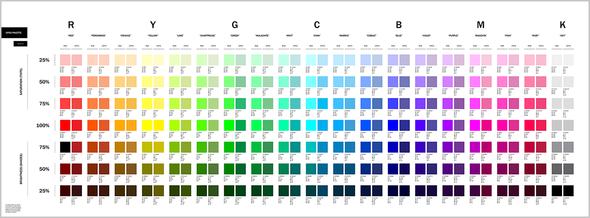
The files below, developed in Adobe InDesign, provide designers and design students with a basic set of RBG and CMYK color swatches. These 266 swatches can be used in graphic design, illustration, UX/UI, information graphics, and architecture/planning to create colorized plans and diagrams.
Zip File Package Download (.zip) Includes
- InDesign File (.indd)
- InDesign Markup Language File (.idml)
- PDF File (.pdf)
- PNG File (.png)
- Web Link
– – –
Background
In the mid-2000s, while working at an architecture firm in Boston, I was frequently asked to create colorized drawings of plans, sections, and elevations. A linework PDF file from the architects or planners would usually arrive in my email inbox with some guidance on how to colorize or key the drawing. Sometimes, I would also receive a marker sketch, usually on a piece of tracing paper, or a rough “bubble diagram.” My job was usually to create a refined, color-coded version of these drawings. Frequently, these colorized drawings and diagrams were used to convey and communicate programmatic and organizational decisions for a building, campus, space, or place to the client.
After meeting with the architect or planner, I would then scan and compile all relevant sketches, plans, and annotations into a single layered file. After doing this many times, I eventually developed a standardized color palette containing a handful of hues, tints, and shades. Since I was also charged with maintaining the firm’s visual identity, I even eventually added this color palette resource to the firm’s brand identity standards manual. Many years after leaving the firm, I still find myself continually using this resource. Thus, I’ve decided to make a slightly expanded version of this color palette available as an open-source download. I’ve used this color palette for many years on hundreds of projects, and I also use it in my teaching.
Approach
When creating this color palette, I took what I would describe as a “hybrid” mathematical, linguistic, and perceptual approach. Without digressing too much, I will use “cyan” as a brief example. A simple way to define “cyan” is to start with 100% cyan as derived via the CMYK color model. If a user were to convert that CMYK swatch of cyan to RGB, the cyan swatch may look nearly identical. But, frequently, the way “cyan” is described in “RGB” is different than cyan when used in CMYK. But the plot thickens further, as there is also the issue of color gamuts. RGB has a much wider color gamut than CMYK—so, again, using cyan as an example, the RGB cyan swatch provided is not at all achievable in CMYK (it would look “dull”). In other cases, the decision between RGB and CYMK was much more straightforward. Using the 100% pink swatches as as an example—the CMYK pink swatch is basically created by directly converting [downsampling] the neighboring RGB swatch to CMYK. So, to make a long story short, I tried my best to make decisions both logically and ontologically.
It should also be noted that the color palette provided here is fundamentally “incomplete.” What it perhaps lacks most is “chroma”—a term coined by Albert Munsell in the early 1900s. Chroma might best be described as the amount of “grayness” perceived in color. Any edits, corrections, or suggestions to this resource are always welcome.
Notes and Tips
- The swatches provided do not contain or refer to PANTONE swatches. You will have to go to PANTONE for that.
- Selecting a swatch, copying and pasting it into a new document (InDesign, etc) automatically adds that swatch into the swatches palette of the new document.
- Printing these documents will look different depending on your printer, and viewing them on screen will also look different depending on your computer, device, or screen. That said, it is somewhat handy to have a color palette such as this pre-printed in a design studio so you have a better idea of what the color you select will look like when or if it prints on that printer.
- If you are interested in learning more about color, I suggest checking out Universal Principles of Color: 100 Key Concepts for Understanding, Analyzing, and Working with Color by Stephen Westland and Maggie Maggio.
FILED IN: Design Research