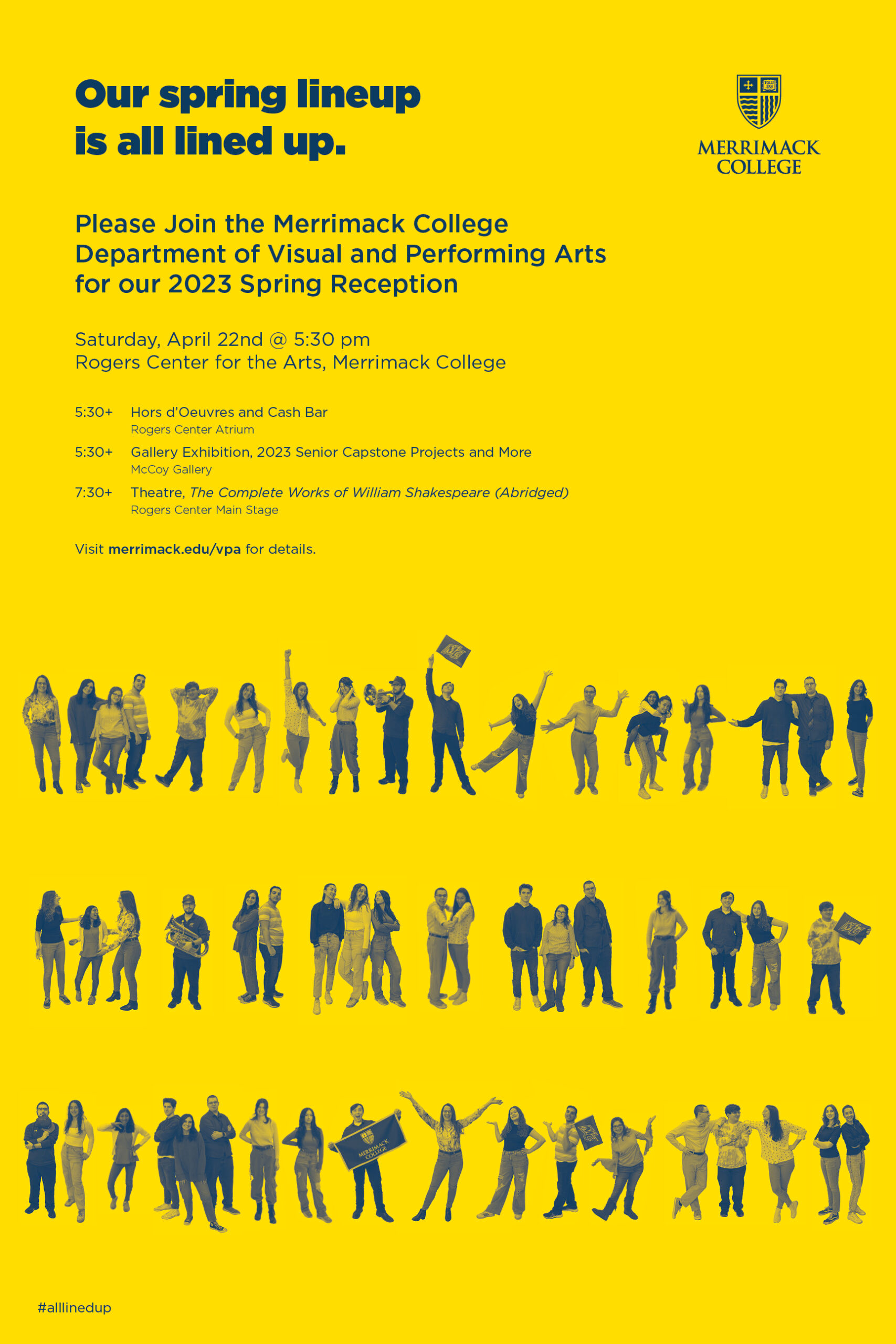
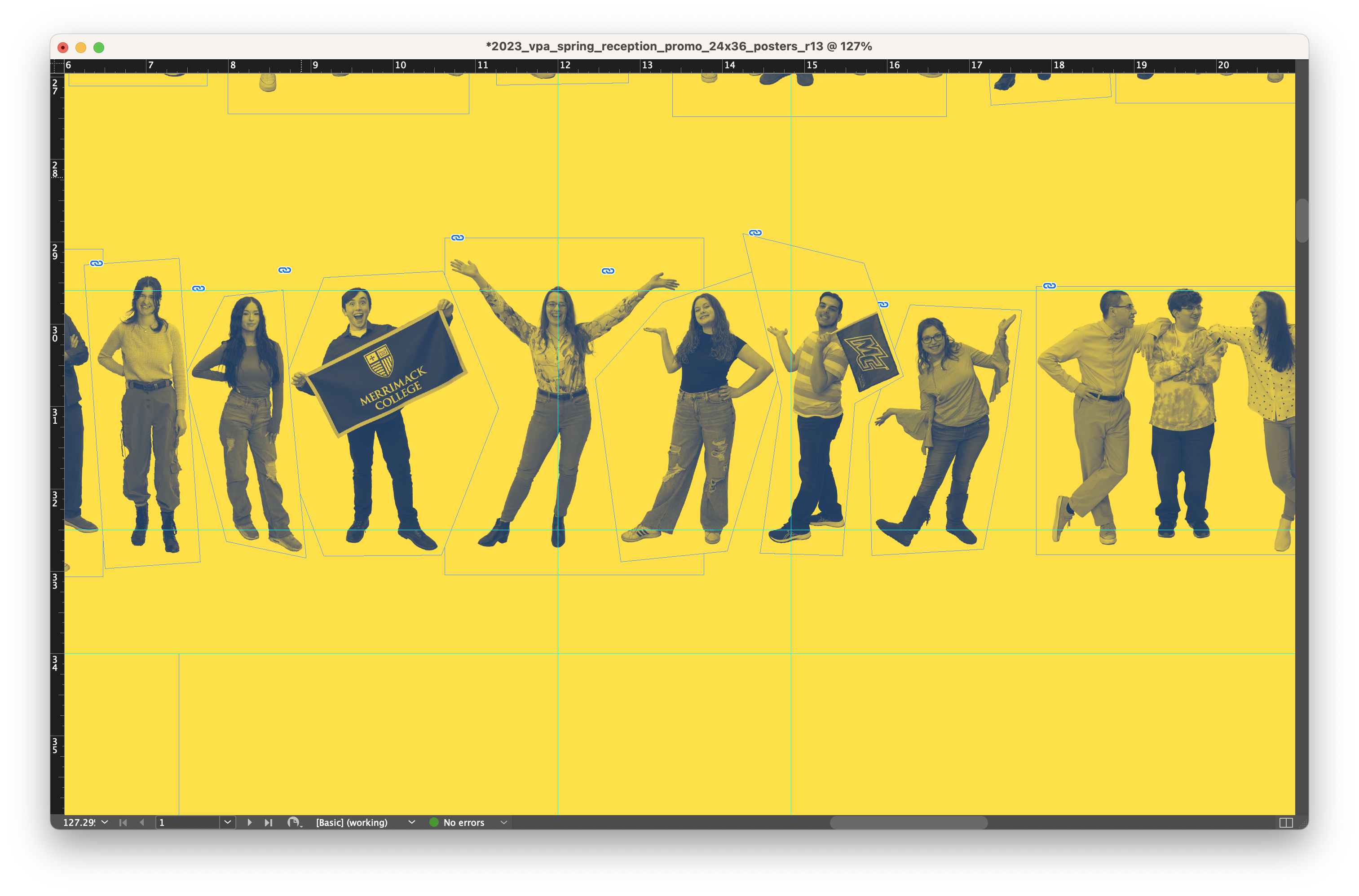
In early 2023 I was asked to develop a promotional campaign for Merrimack College’s Department of Visual and Performing Arts (VPA) April 2023 Spring Alumni and Friends Event. The event is meant to attract alumni and friends of VPA back to the College to experience the annual student exhibition and theatrical performance.
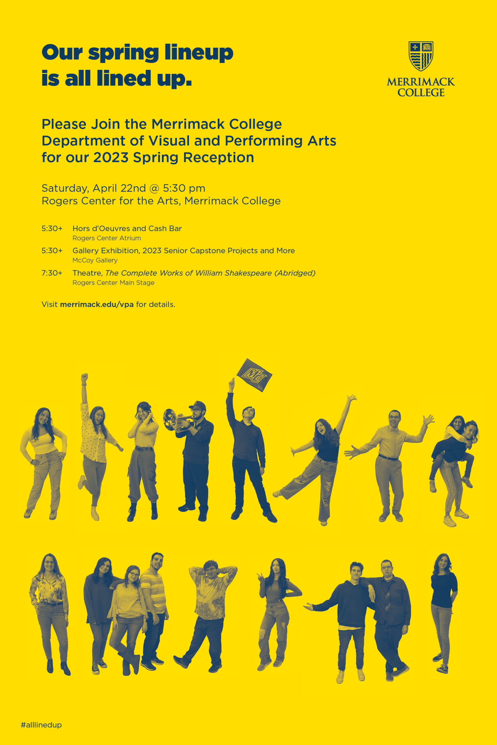
For this concept, I proposed that we visually showcase senior VPA students themselves. To do this, I proposed that we photograph them individually or in small groups, silhouette the images, and then line them up in several rows at the base of the poster. The headline reads, “Our spring lineup is all lined up.”
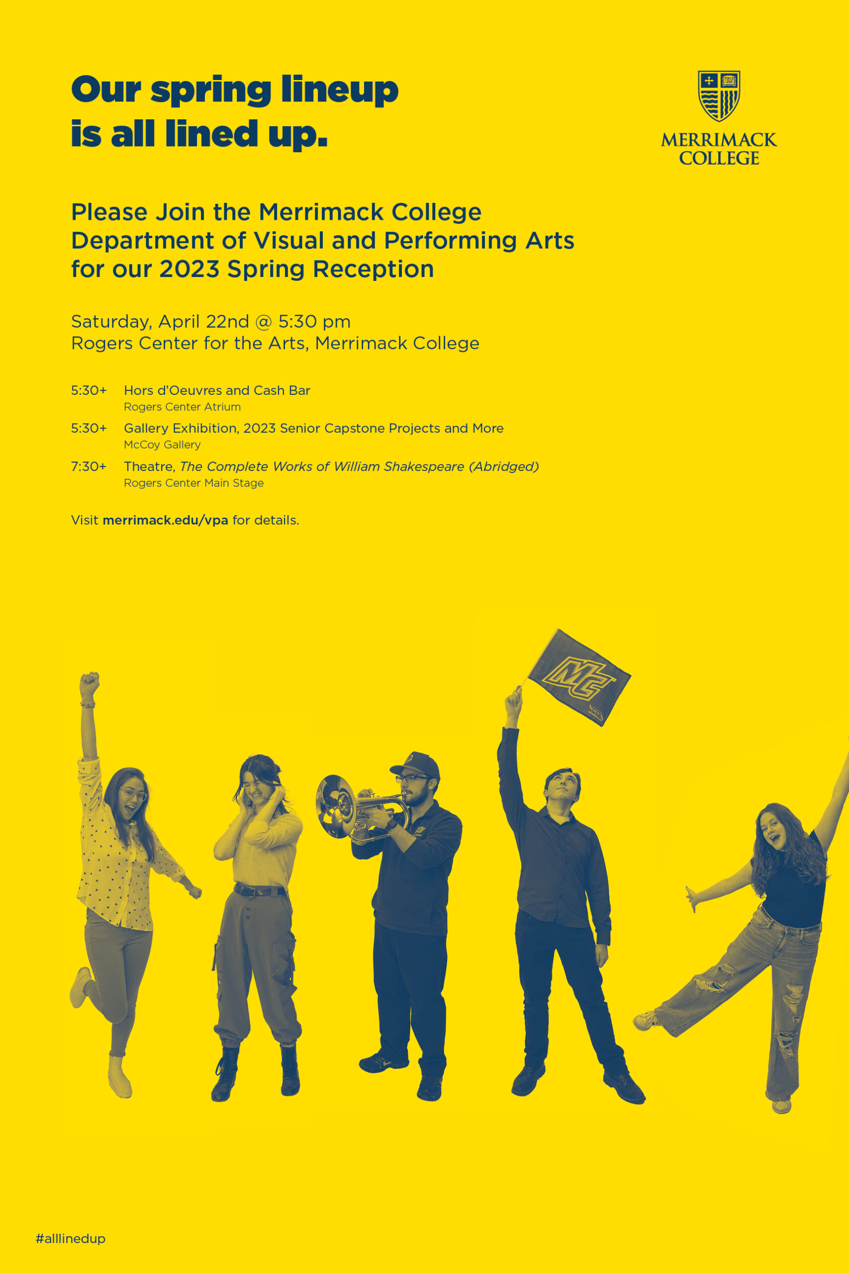
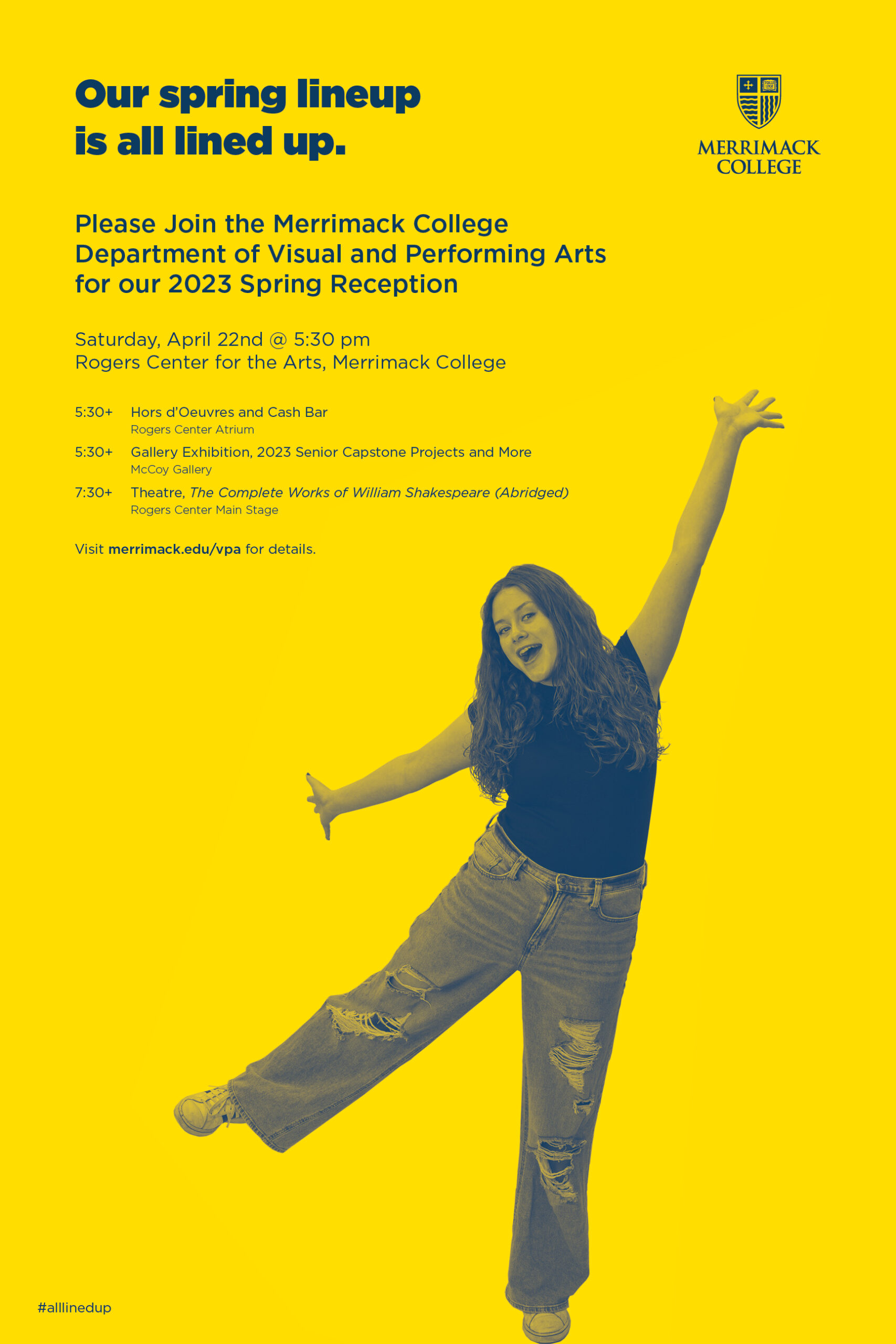
During the actual shoot, we asked the students to hold “props” like musical instruments, pennants, art supplies, etc. These full-color images were then converted to grayscale and tinted using Merrimack’s two signature colors (Blue and Gold), which gives the poster a two-color duotone quality.
For years I have been inspired by Steve Frykholm’s iconic graphic design work for Herman Miller. This poster is directly inspired Frykholm’s 1985 Annual Report cover. While I serving as Creative Director for Shepley Bulfinch, I would consistently reference not only Frykholm’s work—but also the design-centered culture he helped establish at Herman Miller.
Frykholm and Sara Giovanitti’s Annual Report cover featured six rows of employees shot black and white photography. The figures are casually if not whimsically, arranged. A headline on the top right of the report says, “SAY HELLO TO THE OWNERS!” As an aside, Herman Miller is an excellent example of a company that is capitalized through an Employee Stock Ownership Plan or “ESOP.”
Credits—
Graphic Designer: Dan Vlahos
Art Director: Nancy Wynn
Photographer: Colleen Dolan
More FILED IN: Design Research
