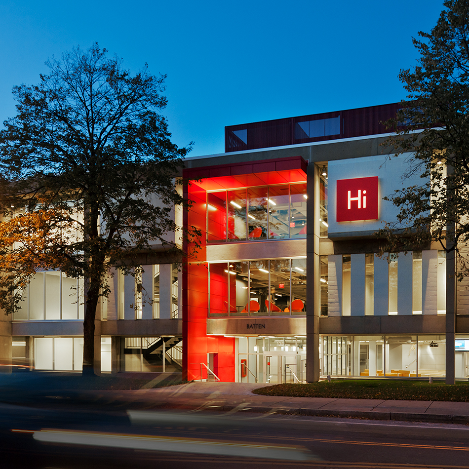
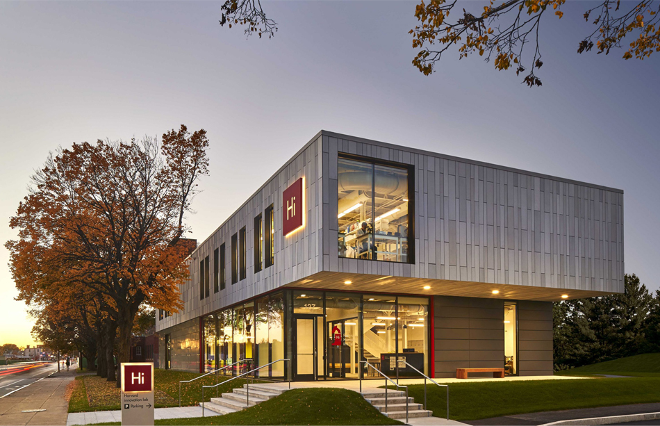
Could a welcoming visual identity help ease tensions between a University and a residential community? In 2009, Harvard halted plans for a $1 billion science center in Allston. This action only increased “town-gown” tensions as large swaths of Harvard-owned land in Allston lay dormant. Thus, when Harvard sought an identity for its newly formed LEED Gold certified Innovation Lab, it became quite clear early on that, first and foremost, it needed to be welcoming—to the academic community (as an interdisciplinary center for entrepreneurship) but also to the local community of residents in Allston. The identity also needed to be flexible enough to support the highly diverse, interdisciplinary mission of the labs. The design team also strongly lobbied the client to open a portion of the building (the first floor) to the public. The labs welcome students and entrepreneurs from all across the University, from the local community, and visitors from around the world. Working alongside architects from Shepley Bulfinch and as the brand lead on the project, the former headquarters of WGBH was renovated and transformed into a vibrant new center connected to the business school campus.
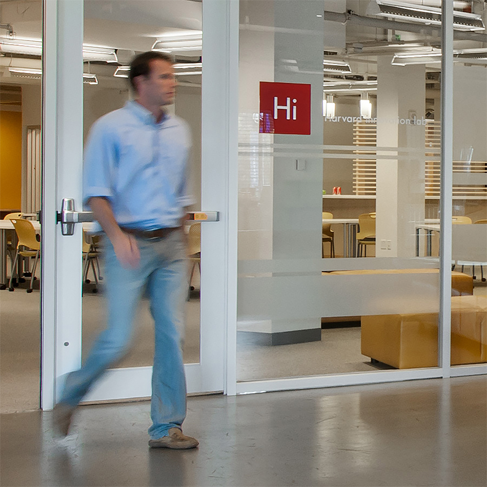
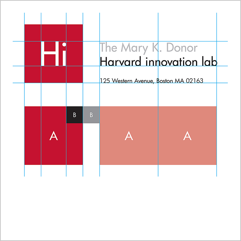
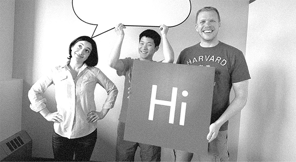
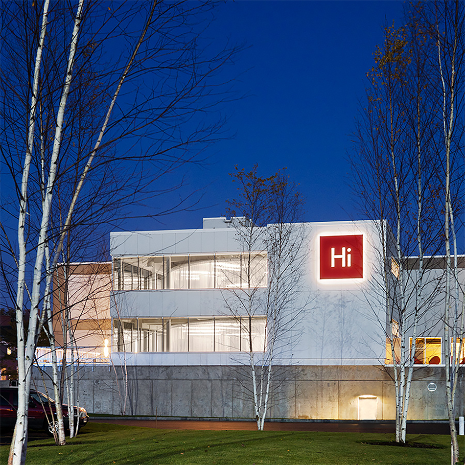
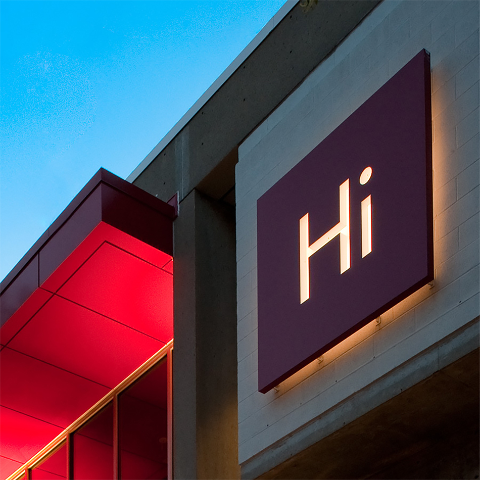
On a fast-track schedule, I led a graphic design and brand team in developing a series of concepts that were initially presented on a spectrum of “Harvard” to “Un-Harvard.” For instance, on the far end of the spectrum, we presented the bold idea to disguise the building entirely, perhaps as a boutique hotel (inspired by the Boston urban apparel store Bodega). On the near end of the spectrum were concepts that used more traditional academic iconography, such as the Harvard seal. The “Hi” icon sat somewhere in the middle. The resultant Hi icon resembles periodic table-like app icons, such as the ones used by Adobe for its Creative Cloud apps. As such, the identity is, in some ways, more of an “icon” or “gesture” rather than a traditional logo. The Harvard community and the Allston community alike quickly fell in love with this symbol for “Harvard innovation.” The illuminated “Hi” icon that was installed on the main building’s facade is nearly eight feet square. Months after the building opened, I received an email from Harvard informing me that school children—as their school buses drove by were waving “Hi” back at the building.
Just as my design team commenced working on this project, we attended a virtual workshop with the New York-based identity designer Sagi Haviv of Chermayeff & Geismar & Haviv. In his workshop, Haviv conveyed the following criteria for designing a “good” graphic identity:
- Appropriate in form and concept
- Pragmatic: works well in the required range of applications and media
- Simple and bold
- Distinctive and memorable
Credits—
- Architecture Firm: Shepley Bulfinch
- Principal Architect: Tom Kearns, FAIA (now of DSK Architects and Planners)
- Creative Director: Dan Vlahos
- Signage Consultant: Roll Barresi & Associates
- Signage and Environmental Graphic Designer: Anna Farrington
- Junior Graphic Designer: Erin Deeley
- Projection Artist: John Powell
- Photographer: Anton Grassl
Press—
- Harvard: Say ‘Hi’ to innovation, The Boston Globe, November 25, 2011.
- Harvard Innovation Labs Announces Record-Setting Student Engagement for Fall Semester, Harvard, September 27, 2023.
Recognition—
- Print: Redefining Design, 66.6, Regional Design Annual, Full Page Feature, December 2012.
- Above the Fold: Alumni Works in Design, 3rd Biennial Juried Alumni Exhibition, Sandra and David Bakalar Gallery, Massachusetts College of Art and Design, June-July, 2015.
Case Studies
Other—
FILED IN: Brand Design