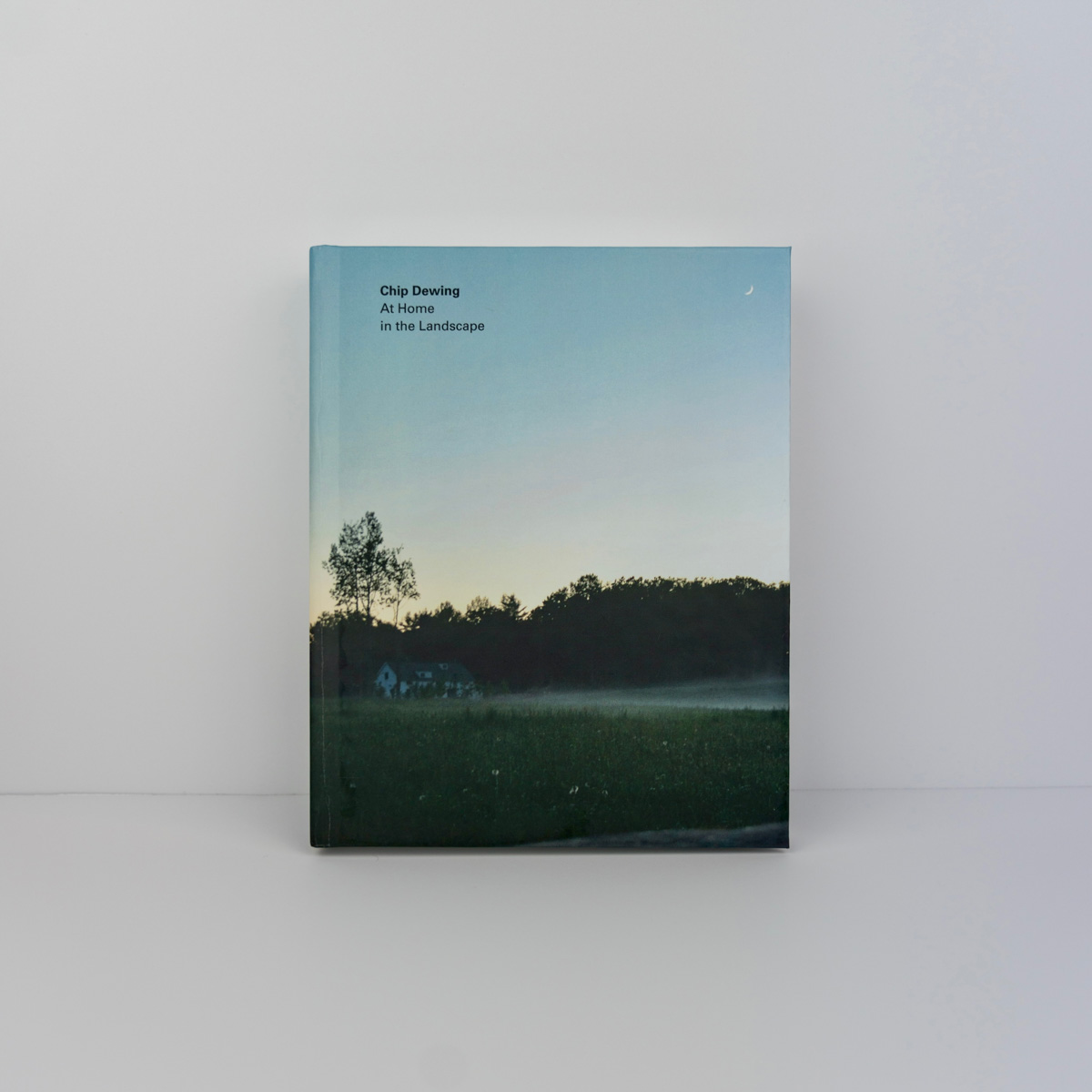
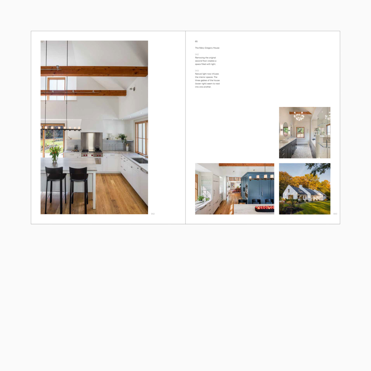
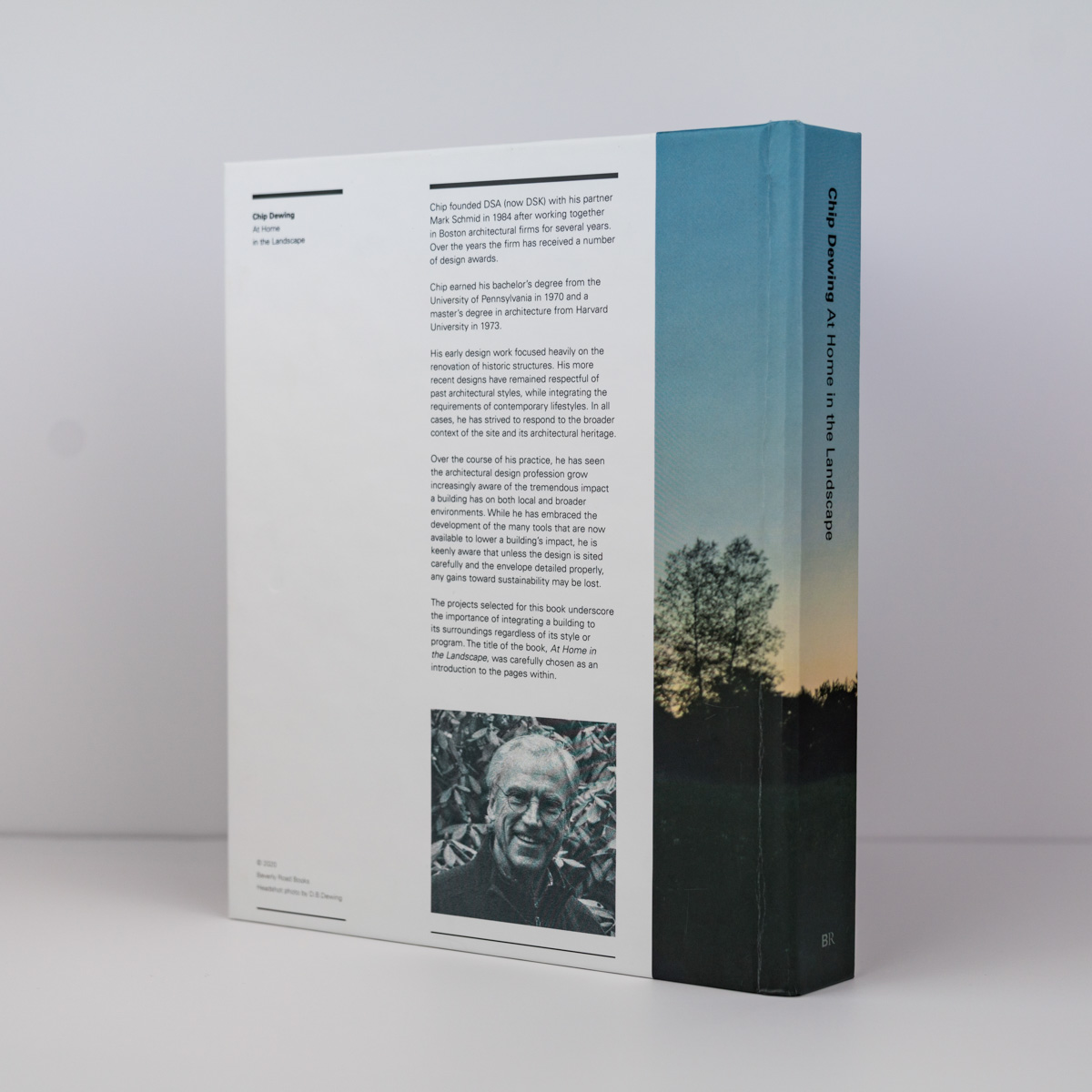
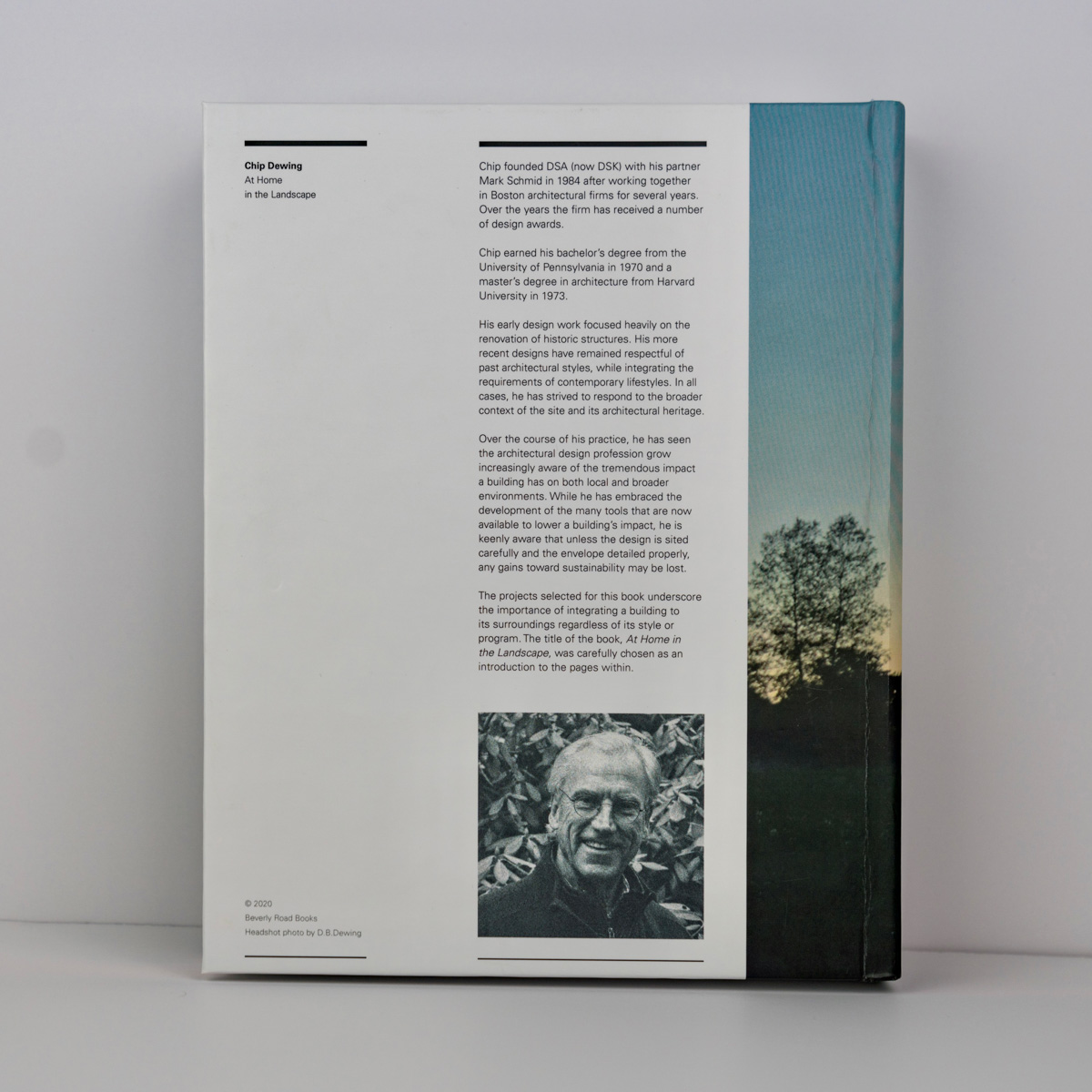
How might a monograph for a regional architect be designed sustainably while also expressing the physicality and object quality of the book itself? Chip Dewing, AIA founded DSA (now DSK) with his partner Mark Schmid in 1984 after working together in Boston architectural firms for several years. Over the years, the firm has received several design awards. Chip earned his bachelor’s degree from the University of Pennsylvania in 1970 and a master’s degree in architecture from Harvard’s Graduate School of Design in 1973.
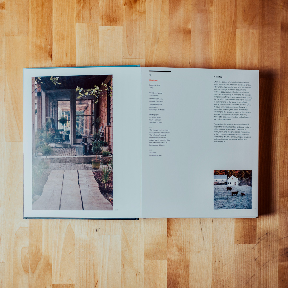
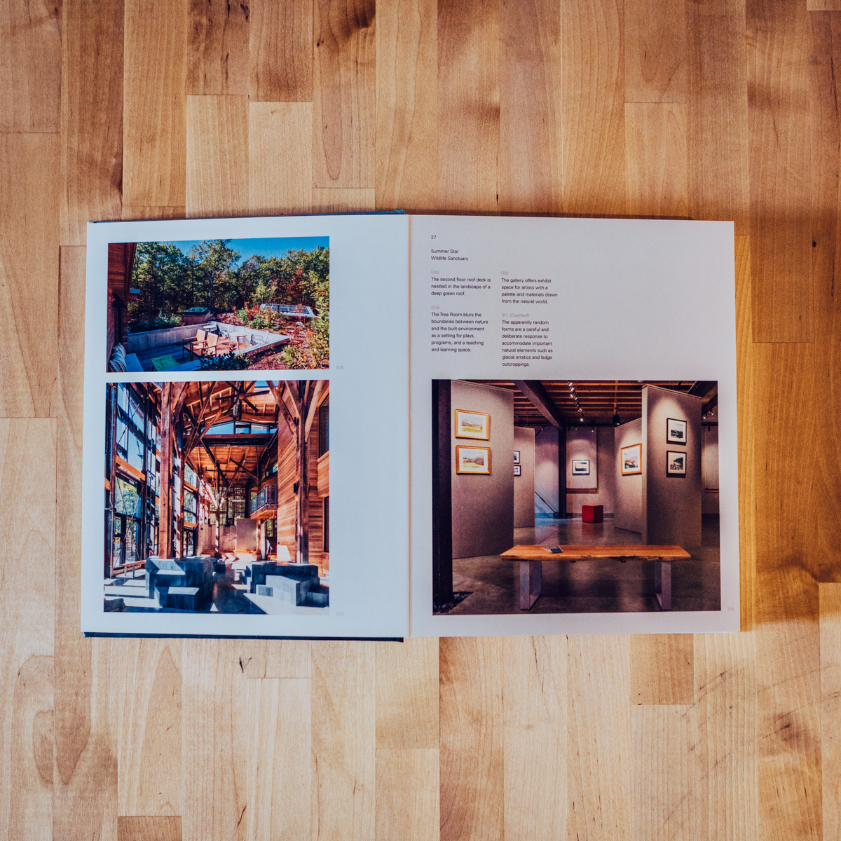
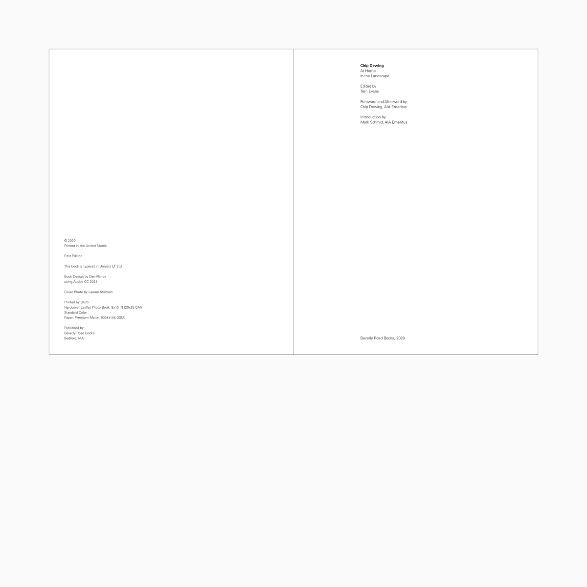
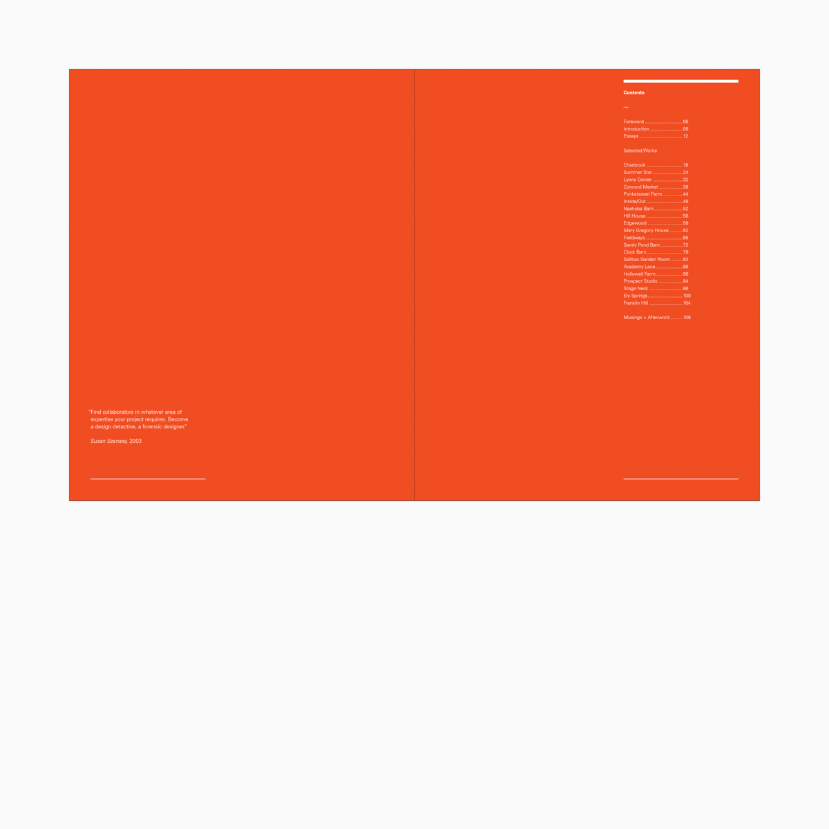
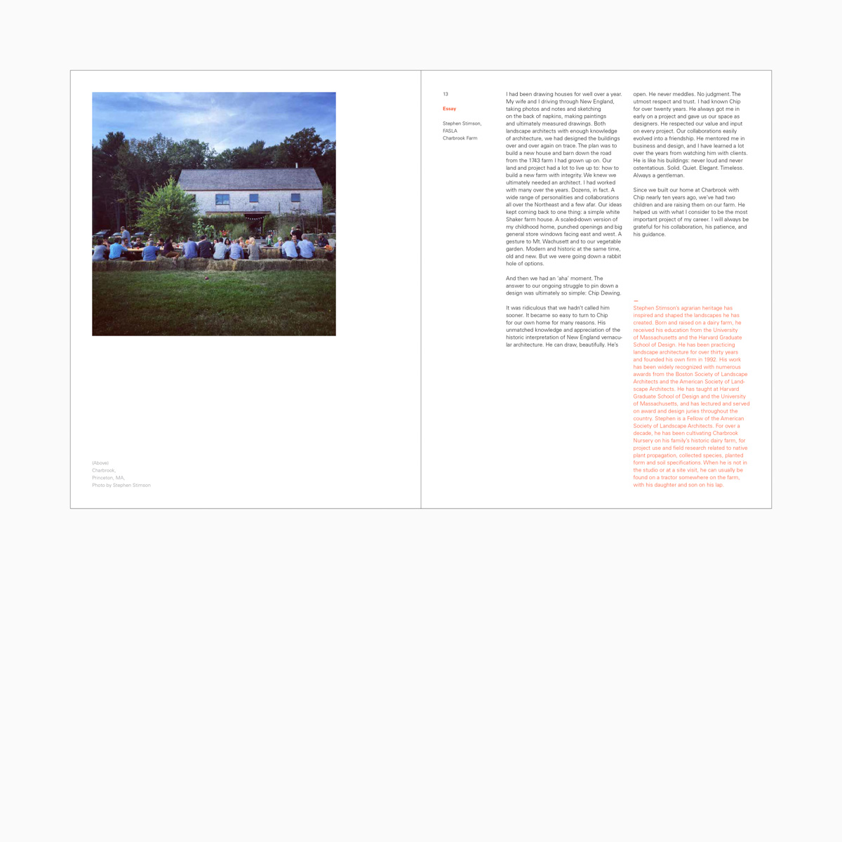
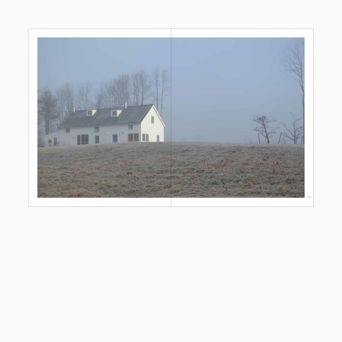
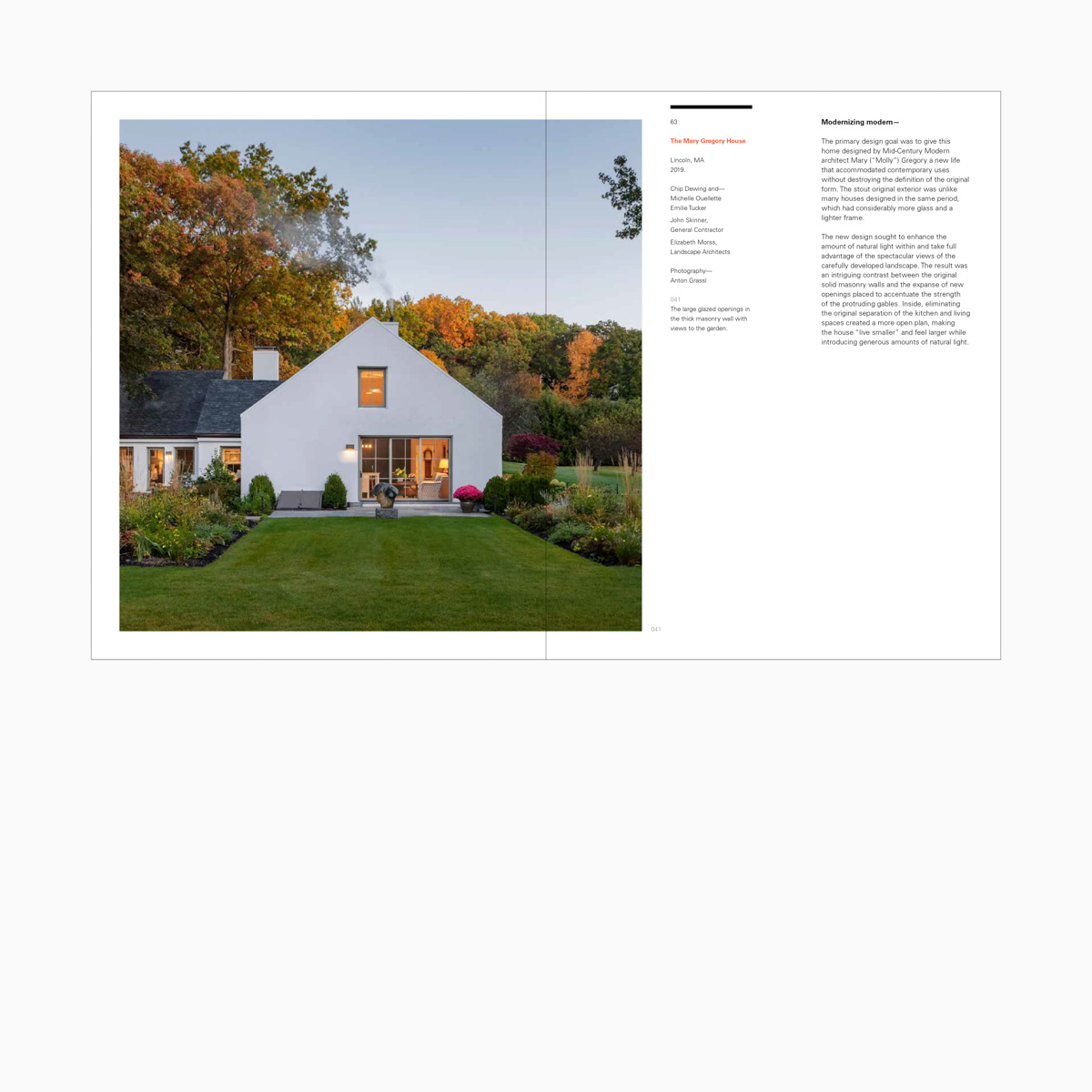
As a limited-edition, hard-bound, 109-page volume, Chip Dewing: At Home in the Landscape chronicles and documents the highly contextual work of this contemporary American architect. Dewing’s early design work focused heavily on the renovation of historic structures. Dewing’s later work fuses past architectural styles with more contemporary approaches—while thoughtfully and oftentimes elegantly integrating the projects’ contexts and programmatic requirements. In all cases, Dewing strived to respond to the broader context of the site and its architectural heritage. Regardless of the aesthetics, the projects selected for this book underscore the importance of integrating architecture into its surroundings. As such, the book’s subtitle, At Home in the Landscape, was carefully chosen as an introduction to the projects featured. The book contains several original essays, an Introduction by Mark Schmid, AIA, and 20 projects selected by Dewing, myself and the editor—all completed between 1992–2020. The book is printed on 100# premium matte Forest Stewardship Council (FSC)-certified paper and bound in a hardcover layflat format. Along with being FSC certified, the paper is acid-free, which ensures the long-term preservation of the book and our environment. The book was printed in the U.S., which reduced the shipping distance and carbon required for transport. The book design was inspired by British minimalist graphic design—most notably the work of William Hall—formed by Hall and Nicholas Barba when they left the architectural studio of John Pawson in 2003. Because the book is printed using on-demand production techniques (versus a larger run), the resources required to produce the book are more accurately managed.
Over the course of his practice, Dewing saw the architectural design profession grow increasingly aware of the tremendous impact a building has on both local and broader environments. While Dewing embraced many tools available to lower a building’s impact, he was keenly aware that unless the design is sited carefully and unless the envelope is detailed properly, any gains toward sustainability may be lost.
In the closing section, there are three big lessons that Dewing shares in an Afterword. The first is to Address the site; the second is to Convey a sense of place, and the third is to Communicate a sense of arrival. Dewing shares these key lessons as he steps away from the firm that he co-founded. With a special focus on addressing, conveying, and communicating—there are certainly lessons embedded in Dewing’s architectural practice and thus the book itself—but moreover, there is a sense of care, attention, and delight. In this way, according to his clients, Dewing helped establish an “ethos” that served to propel the present-day DSK towards a vast mix of architecture and planning projects nationwide.
- Tolle Lege Collection, McQuade Library, Merrimack College, North Andover, MA
- Summer Star Wildlife Sanctuary, Boylston, MA
- Boston Society for Architecture, The Boston Chapter of the American Institute of Architects, Boston, MA
Credits—
- Edited by: Terri Evans
- Photography: Lauren Stimson, Anton Grassl, Stephen Stimson, Jonathan Levitt, Eric Roth, Mark Doyle, Chuck Mayer, Rick Mandelkorn, Nick Wheeler, Joe Wallace
- Book Design: Dan Vlahos
- Portfolio Photography: Nicholas Paolino
Case Studies—
FILED IN: Design Research
