How do we make an expansive and flexible campus facility offering innovative spatial and technological approaches to teaching and learning within a library a desirable destination?
In 2008, I was asked to lead the process of naming and visually branding this innovative and experimental teaching and learning center. Located on the lower level of Perkins Library, the Link project represented an important opportunity for the University to evaluate and assess decisions concerning the design of learning spaces at Duke. The original brief from the University sought to not only develop an excellent and desirable teaching space, but a space that would foster “place.” Assessing that experimentation and sense of place was a key concern for future academic space planning at Duke. Therefore, significant attention was paid to gathering data about the use of the space and the overall implementation of the project’s vision. The result of this data analysis was made publicly available as an assessment report.
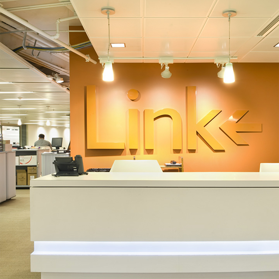
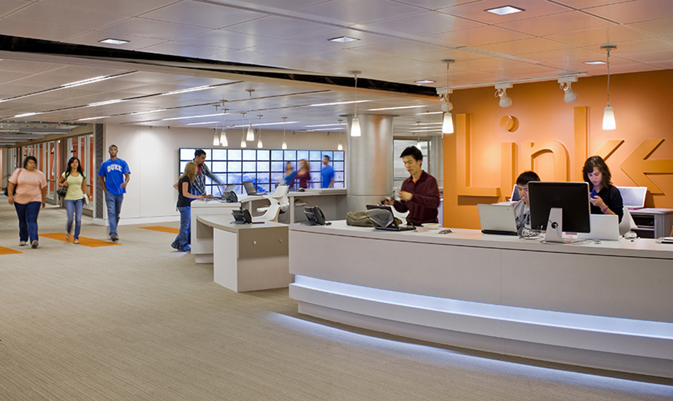
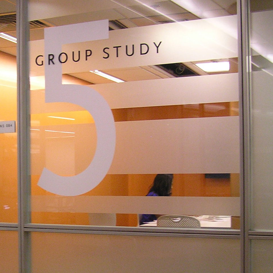
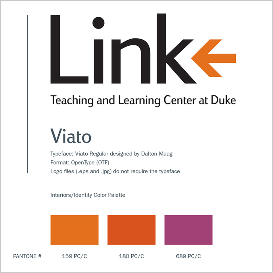
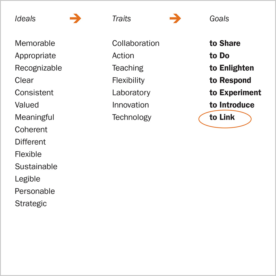
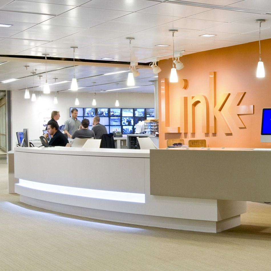
Developing the Link identity involved meeting and collaborating with faculty, librarians, staff, facility managers, architects, and interior designers. To work through initial and eventually final concepts, we hosted a design charrette (with free pizza) in the library. The final Link logotype appears on signage, apparel worn by staff, and the Link website. The logotype’s arrow, part of the AIGA standard symbols set, points back into the “k” of Link, emphasizing knowledge, connection, and reflection. Architect Tom Kearns, FAIA, led the design of the space. For the interior architecture and interior design Kearns and interior designer Joe Rondinelli were inspired by the architecture of Charles Moore, flexible technology spaces, and retail environments. Likewise, the branding and environmental graphic design were inspired by the bold graphics of Barbara Stauffacher Solomon, who worked with Moore on several projects in the late 1960s, including Sea Ranch in California. The Sea Ranch came to be “the California architectural monument of the 1960s,” in the words of the design historian David S. Gebhard.
In the published assessment of the Link, students and faculty typically singled out the “architecture and design concept” as a key element of its success.
Credits—
- Architecture Firm: Shepley Bulfinch
- Principal Architect: Tom Kearns, FAIA (now of DSK Architects and Planners)
- Visual Identity Design: Dan Vlahos
- Signage Consultant: Roll Barresi & Associates
- Signage and Environmental Graphic Design: Anna Farrington
- Contributing Designer: Caroline Shannon, AIA
- Photographer: Anton Grassl
Case Studies—
More FILED IN: Brand Design